1.1 Adding Styles to HTML
1.2 Rule Structure
1.3 At-rules
1.4 Comments
1.5 Style Precedence
1.6 Element Classification
1.7 Element Display Roles
1.8 Basic Visual Layout
1.9 Floating
1.10 Positioning
1.11 Flexible Box Layout
1.12 Grid Layout
1.13 Table Layout
2.1 Keywords
2.2 Color Values
2.3 Number Values
2.4 Percentage Values
2.5 Length Values
2.6 Fraction Values
2.7 URIs
2.8 Angles
2.9 Times
2.10 Frequencies
2.11 Position
2.12 Strings
2.13 Identifiers
2.14 Attribute Values
2.15 Calculation Values
2.16 Variable Values
3.1 Selectors
3.2 Structural Pseudo-Classes
3.3 The Negation Pseudo-Classes
3.4 Interaction Pseudo-Classes
3.5 Pseudo-Elements
3.6 Media Queries
3.7 Feature Queries
4.1 Inheritance and Animation
4.2 Value Syntax Conventions
4.3 Universal Values
4.4 Properties
Cascading Style Sheets (CSS) is the World Wide Web Consortium (W3C) standard for the visual presentation of web pages (although it can be used in other settings as well). After a short introduction to the key concepts of CSS, this pocket reference provides an alphabetical reference to all CSS3 selectors, followed by an alphabetical reference to CSS3 properties.
Styles can be applied to documents in three distinct ways, as discussed in the following sections.
In HTML, style information can be specified for an individual element via the style attribute. The value of a style attribute is a declaration block (see the section "Rule Structure" on page 5) without the curly braces:
<p style="color: red; background: yellow;">Look out!
This text is alarmingly presented!</p>
Note that as of this writing, only the content of a single declaration block can be used as a style attribute value. For example, it is not possible to place hover styles (using :hover) in a style attribute, nor can @import be used in this context.
Although typical XML document languages (such as SVG) support the style attribute, it is unlikely that all XML languages will support a similar capability. Because of this---and especially because it encourages poor authoring practices---authors are discouraged from using the style attribute, and thus inline styles.
A stylesheet can be embedded within an HTML document using the style element:
<html><head><title>Stylin'!</title>
<style type="text/css">
  h1 {color: purple;}
  p {font-size: smaller; color: gray;}
</style>
</head> …
</html>
XML-based languages may or may not provide an equivalent capability; always check the document type definition (DTD) to be certain. While style elements are often found inside the head element, as shown in the preceding example, this is not required. Sometimes stylesheets are embedded near the end of a document for performance reasons.
Styles can be stored in a separate file. The primary advantage to using a separate file is that when commonly used styles are collected in a single file, all pages using those styles can be updated by editing a single stylesheet. A downside is that it's generally more efficient to embed all styles (and scripts) into an HTML document in order to reduce network calls, although this downside will disappear as HTTP/2 usage increases.
One or more @import directives can be placed at the beginning of any stylesheet. For HTML documents, this is done within an embedded stylesheet:
<head><title>My Document</title>
<style type="text/css">
  @import url(site.css);
  @import url(navbar.css);
  @import url(footer.css) screen and (min-width: 960px);
  body {background: yellow;}
</style>
</head>
Note that @import directives can appear at the top (and, according to the specification, only at the top) of any stylesheet. Thus, one stylesheet could import another, which in turn would import a third.
In HTML documents, the link element can be used to associate a stylesheet with a document. Multiple link elements are permitted. The media attribute can be used to restrict a stylesheet to one or more media environments:
<head>
<title>A Document</title>
<link rel="stylesheet" type="text/css" href="basic.css"
  media="all">
<link rel="stylesheet" type="text/css" href="web.css"
  media="screen and (max-width: 960px)">
<link rel="stylesheet" type="text/css" href="paper.css"
  media="print and (color-depth: 2)"> </head>
It is also possible to link to alternate stylesheets, but few browsers provide a way for users to make use of them. As of this writing, most or all known user agents load all linked stylesheets, including the alternate stylesheets, regardless of whether the user ever needs them.
In XML documents (such as XHTML documents sent with a MIME type of text/xml, application/xml, or application/ xhtml+xml), an xml-stylesheet processing instruction can be used to associate a stylesheet with a document. Any xmlstylesheet processing instructions must be placed in the prolog of an XML document. Multiple xml-stylesheet processing instructions are permitted. The media pseudo-attribute can be used to restrict a stylesheet to one or more forms of media:
<?xml-stylesheet type="text/css" href="basic.css"
  media="all"?>
<?xml-stylesheet type="text/css" href="web.css"
  media="screen"?>
<?xml-stylesheet type="text/css" href="paper.css"
  media="print"?>
The last (and least common by far) way of associating an external stylesheet with your pages is to use an HTTP Link header. This approach uses HTTP headers to replicate the effects of a link element or @import directive.
Adding a line such as this to the .htaccess file at the root level of your server will make this happen for all pages on the site, where /style.css is the server path of the stylesheet to be loaded:
"</style.css>;rel=stylesheet;type=text/css;media=all"
rel="stylesheet":
This attribute indicates that the linked file is a stylesheet, which defines how the HTML content should be displayed.
href="style.css":
This attribute specifies the URL of the CSS file to be linked.
type="text/css":
This attribute specifies the MIME type of the linked file, indicating that it is a CSS file. While technically redundant, it's good practice to include it for clarity.
media="all":
This attribute specifies that the stylesheet applies to all media types. This means it will be applied to screens, printers, and any other media for which the browser supports style sheets. If you want to target specific devices, you can use other media types like screen, print, or speech or use media queries.
As an alternative to using .htaccess, which has been known to cause performance problems, you can edit your httpd.conf file to do the same thing:
<Directory /usr/local/username/httpdocs>
  "</style.css>;rel=stylesheet;type=text/css;media=all"
</Directory>
where /usr/local/username/httpdocs is replaced with the Unix pathname of your website's actual home directory, and /style.css is replaced with the location of the stylesheet within that home directory.
As of this writing, HTTP headers were not supported by all user agents, most notably Internet Explorer and Safari. Thus, this technique is usually limited to production environments based on other user agents, and the occasional Easter egg for Firefox and Opera users.
A stylesheet consists of one or more rules that describe how page elements should be presented. Every rule has two fundamental parts: the selector and the declaration block. Figure 1-1 illustrates the structure of a rule.
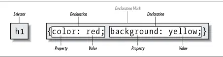
Figure 1-1. Rule structure
On the left side of the rule, we find the selector, which selects the parts of the document to which the rule should be applied. Selectors can stand singly or be grouped as a comma-separated list; e.g., to select the top three heading levels at once, the selector group would be h1, h2, h3. On the right side of the rule, we have the declaration block. A declaration block is made up of one or more declarations; each declaration is a combination of a CSS property and a value of that property.
The declaration block is always enclosed in curly braces. A declaration block can contain several declarations; each declaration must be terminated with a semicolon (;). The exception is the final declaration in a declaration block, for which the semicolon is optional (though recommended).
Each property, which represents a particular stylistic parameter, is separated from its value by a colon (:). Property names in CSS are not case-sensitive. Legal values for a property are defined by the property description. Chapter 4 provides details on acceptable values for CSS properties.
A CSS at-rule is a statement or block of rules that begins with a specific identifier preceded by an @ sign. These are:
Besides these statements, there are a number of conditional at-rules.
These include:
There are other proposed at-rules which are, as of early 2018, at various stages of development. These include @document, @font-feature-values, @page, and @viewport.
Including comments in CSS is simple. You open with /* and end with */, like this:
/* This is a comment! */
Comments can be multiple lines long:
/* This is a comment!
This is a continuation of the comment.
And so is this. */
They can also occur anywhere within a stylesheet except in the middle of a property name or value:
h1/* heading-level-1 */ {color /* foreground color */:
  rgba(23,58,89,0.42)/* RGB + opacity */;}
HTML (properly SGML) comments <!‐- such as this ‐-> are permitted in stylesheets so as to hide the styles from browsers so old that they don't understand HTML 3.2. They do not act as CSS comments; that is, anything contained in an HTML comment will be seen and interpreted by the CSS parser.
A single HTML document can import and link to multiple external stylesheets, contain one or more embedded stylesheets, and make use of inline styles. In the process, it is quite possible that some rules will conflict with one another. Cascading Style Sheets uses a mechanism called the cascade to resolve any such conflicts and arrive at a final set of styles to be applied to the document. Two key components of the cascade are specificity and inheritance.
Specificity describes the weight of a selector and any declarations associated with it. Table 1-1 shows how much each part of a selector contributes to the total specificity of that selector.
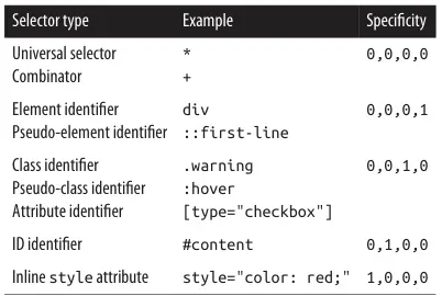
Table 1-1. Selector type specificity
Specificity values are cumulative; thus, a selector containing two element identifiers and a class identifier (e.g., div.aside p) has a specificity of 0,0,1,2. Specificity values are sorted from right to left; thus, a selector containing 11 element identifiers (0,0,0,11) has a lower specificity than a selector containing just a single class identifier (0,0,1,0).
The !important directive gives a declaration more weight than nonimportant declarations. The declaration retains the specificity of its selectors and is used only in comparison with other important declarations.
The elements in a document form a treelike hierarchy, with the root element at the top and the rest of the document structure spreading out below it (which makes it look more like a tree root system, really). In an HTML document, the html element is at the top of the tree, with the head and body elements descending from it. The rest of the document structure descends from those elements. In such a structure, elements lower down in the tree are descendants of the ancestors, which are higher in the tree.
CSS uses the document tree for the mechanism of inheritance, in which a style applied to an element is inherited by its descendants. For example, if the body element is set to have a color of red, that value propagates down the document tree to the elements that descend from the body element. Inheritance is interrupted only by a conflicting style rule that applies directly to an element. Inherited values have no specificity at all (which is not the same as having zero specificity).
Note that some properties are not inherited. A property will always define whether it is inherited. Some examples of noninherited properties are padding, border, margin, and background.
The cascade is how CSS resolves conflicts between styles; in other words, it is the mechanism by
which a user agent decides, for example, what color to make an element when two different rules
apply to it and each one tries to set a different color.
Here's how the cascade works:
Any presentational hints that come from non-CSS sources (e.g., the preference dialog within a browser) are given the same weight as the user agent's default styles (see step 2 above).
Broadly speaking, CSS groups elements into two types: nonreplaced and replaced. Although the types may seem rather abstract, there actually are some profound differences in how the two types of elements are presented. These differences are explored in detail in Chapter 7 of CSS: The Definitive Guide, 4th Edition (O'Reilly).
The majority of HTML elements are nonreplaced elements, which means their content is presented by the user agent inside a box generated by the element itself. For example, <span>hi there</span> is a nonreplaced element, and the text hi there will be displayed by the user agent. Paragraphs, headings, table cells, lists, and almost everything else in HTML are nonreplaced elements.
In contrast, replaced elements are those whose content is replaced by something not directly represented by document content. The most familiar HTML example is the img element, which is replaced by an image file external to the document itself. In fact, img itself has no actual content, as we can see by considering a simple example:
<img src="howdy.gif" alt="Hi">
There is no content contained in the element---only an element name and attributes. Only by replacing the element's lack of content with content found through other means (in this case, loading an external image specified by the src attribute) can the element have any presentation at all. Another example is the input element, which may be replaced with a radio button, checkbox, or text input box, depending on its type. Replaced elements also generate boxes in their display.
In addition to being replaced or not, there are two basic types of element display roles in CSS: block-level and inline-level. All CSS display values fall into one of these two categories. It can be important to know which general role a box falls into, since some properties only apply to one type or the other.
Block-level boxes are those where the element box (by default) fills its parent element's content area width and cannot have other elements to its sides. In other words, block-level elements generate "breaks" before and after the element box. The most familiar block elements from HTML are p and div. Replaced elements can be block-level elements but usually are not.
List items are a special case of block-level elements. In addition to behaving in a manner consistent ith other block elements, they generate a marker---typically a bullet for unordered lists or a number for ordered lists---which is "attached" to the element box. Except for the presence of this marker, list items are identical to other block elements.
As of early 2018, the display values that create block boxes are block, list-item, table, table-row- group, table-headergroup, table-footer-group, table-column-group, table-row, table-column, table-cell, table-caption, flex, and grid.
Inline-level boxes are those where an element box is generated within a line of text and does not break up the flow of that line. Perhaps the best-known inline element is the a element in HTML. Other examples are span and em. These elements do not generate a break before or after themselves, so they can appear within the content of another element without disrupting its display.
Note that although the CSS block and inline elements have a great deal in common with HTML block-and- inline-level elements, there is an important difference. In HTML, block-level elements cannot descend from inline-level elements, whereas in CSS, there is no restriction on how display roles can be nested within each other.
The display values that create inline boxes are: inline, inlineblock, inline-table, and ruby. As of this writing, it was not explicitly defined that the various Ruby-related values (e.g., ruby-text) also generate inline boxes, but this seems the most likely outcome.
CSS defines algorithms for laying out any element in a document. These algorithms form the underpinnings of visual presentation in CSS. There are two primary kinds of layout, each with very different behaviors: block-level and inline-level layout.
A block-level box in CSS generates a rectangular box called the element box, which describes the amount of space occupied by an element. Figure 1-2 shows the components of an element box.
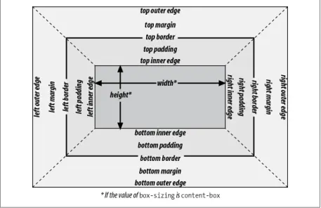
Figure 1-2. The complete box model
An inline-level box in CSS generates one or more rectangular boxes called inline boxes. The following rules apply to inline boxes:
There are a few rules even more obscure than those last two; see the CSS box model documentation for details.
All inline elements have a line-height, which has a great deal to do with how the elements are displayed. The height of a line of text is determined by taking the following factors into account:
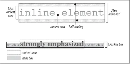
Figure 1-3. Inline layout details
Floating allows an element to be placed to the left or right of its containing block (which is the nearest block-level ancestor element), with following content flowing around the element. Any floated element automatically generates a block box, regardless of what type of box it would generate if not floated. A floated element is placed according to the following rules:
When elements are positioned, a number of special rules come into play. These rules govern not only the containing block of the element, but also how it is laid out within that element.
There are five types of positioning:
The containing block of a positioned element is determined as follows:
Flexible box layout (also known as flexbox or flex layout) is ideal for almost any one-dimensional layout; that is, situations where a number of elements need to be placed and distributed along a line. There are two kinds of flex elements: the flex container and the flex items that are placed within the container.
All the direct children of the flex container element are flex items.
There are two kinds of flex containers: block flexboxes (display: flex) and inline flexboxes (display: inline-flex). These are very much like block and inline-block boxes.
Flex items are laid out in a single line by default, even if this causes the flex items to overflow the flex container. This behavior can be changed using the flex-wrap property.
Figure 1-4 shows the values (and their effects) of the justify content and align-items properties.
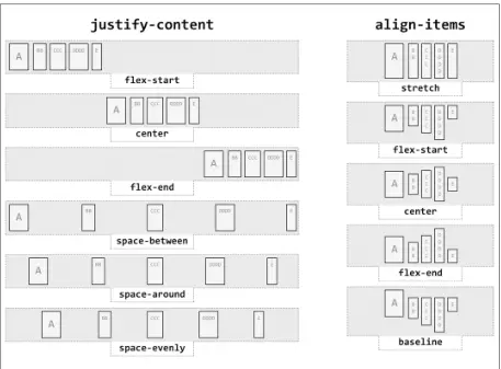
Figure 1-4. Justify and align values
The process of calculating flex sizes is fairly complex. Here's a simplified version of the algorithm:
Again, this is a simplified version of the actual flex sizing algorithm given in the W3C documentation. Consult section 9.7 of the CSS Flexible Box Layout Module Level 1 for full details if you want to know more.
Grid layout is ideal for almost any two-dimensional layout. There are two kinds of grid elements: the grid container and the grid items that are placed within the container. All the direct children of the grid container element are grid items.
There are two kinds of grid containers: block grids (display: grid) and inline grids (display: inline-grid). These are very much like block and inline-block boxes.
A grid is made up of the following components, as illustrated in Figure 1-5:
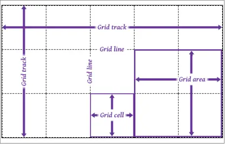
Figure 1-5. Grid layout components
The placement of grid lines can be quite complex, and is accomplished by defining grid track sizes. Between each grid track, a grid line is placed. These lines can be labeled with gridline names, or left unlabeled and later addressed using numbers.
The formal syntax for defining grid track sizes is quite complicated, but the components are relatively simple to list and explain:
Any non-negative length or percentage value. Thus, 5em defines a 5-em gap between grid lines, whereas 5% creates a gap between lines that is 5% of the total grid length in the given direction (i.e., the horizontal length for grid rows, and the vertical length for columns).
A positive real number with the unit identifier fr (e.g., 2fr or 3.14fr) which defines a flex factor for the grid track.
Sets the grid track's width (or height) to be as small as possible while still containing all th content within the grid track. For example, column tracks that contain only text will become as narrow as the widest run of text that cannot be line- broken within the track.
Sets the grid track's width (or height) to be large enough to contain the largest rendering of all the content within the grid track. For example, column tracks that contain only text will become as wide as the longest run of text, without any line-wrapping of the text.
In most cases, auto is equivalent to the largest minimum size of the grid items occupying the grid track; that is, once all the minimum sizes of the grid items in the track have been determined, the track is made as wide as the widest of those minimums. When auto is used as a maximum value (see minmax() later in this list), it is identical to max-content.
Sets a range of sizes outside which the grid track cannot grow or shrink. Either <min> or <max> can be a <length> or <percentage> value, min-content, or max-content. <max> can be a <flex> value, but <min> cannot. If the minimum value computes to be larger than the maximum computed value, the maximum sizing is ignored and the minimum size is used as a minimum.
Equivalent to minmax(auto,max-content) with an exception: if the track's size is larger than the auto value's computed value, that size can't go higher than the given value (a <length> or <percentage>). This is intended to let authors declare a maximum track size while still letting the track size be content-bound below that maximum.
Allows authors to repeat a pattern of grid track sizes as many times as they like. The <integer> value must be positive. auto-fill and auto-fit delegate the number of tracks to the user agent. <track-list> can be any valid combination of track sizes.
There are three kinds of track sizing. These are:
Tracks are given a size in absolute lengths (such as px or em), or sized with %. Percentage values count as fixed track sizes because they are always the same for a given grid container size. The tracks' sizing does not depend on their contents.
Tracks are given a flex or fractional sizing via the fr unit. Their sizing does not depend on their contents.
The tracks' size is dependent on the things found within them; i.e., with min-content, max-content, fit-content(), and auto. These tracks may always be the same size for a given container size and set of content, but they are not regarded as fixed for layout purposes because their contents directly affect their sizing.
The process of actually determining the size of grid tracks, including what to do when track sizes are overconstrained or could lead to circular dependencies, is too long to go into here. In broad strokes, this is the process to find the track sizes:
The details of each step are quite lengthy, and can be found in section 11 of the CSS Grid Layout Module Level 1 documentation.
The layout of tables can get quite complicated, especially because CSS defines two different ways to calculate table and cell widths, as well as two ways to handle the borders of tables and elements internal to the table. Figure 1-6 illustrates the components of a table.
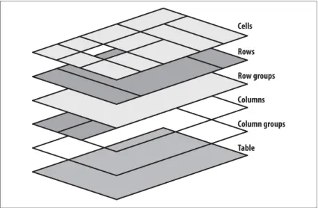
Figure 1-6. Table layout components
In general, a table is laid out according to the following principles:
The fixed-layout model is fast because its layout doesn't depend on the contents of table cells; it's driven by the width values of the table, columns, and cells within the first row of the table. The fixed-layout model uses the following steps:
At that point, the width of the table is set to be either the value of width for the table or the sum of the column widths, whichever is greater. If the table turns out to be wider than the column widths, the difference is divided by the number of columns and added to each of them.
The automatic-layout model, although not as fast as the fixedlayout model, is likely to be much more familiar to authors, because it's substantially the same model that HTML tables have used for years. In most current user agents, use of this model will be triggered by a table with a width of auto, regardless of the value of table-layout--- although this is not assured.
Here's how the model works:
In addition, the user agent must take into account that when a column width has a percentage value for its width, the percentage is calculated in relation to the width of the table---even though that width is not known yet. The user agent must hang on to the percentage value and use it in the next part of the algorithm. Once the user agent has determined how wide or narrow each column can be, it can calculate the width of the table. This happens as follows:
Once the last step is completed (and only then), the user agent can actually lay out the table.
The collapsing cell model largely describes how HTML tables have always been laid out when they have no cell spacing. The following rules govern this model:
When two or more borders are adjacent, they collapse into each other, as shown in Figure 1-7. There are strict rules governing which borders will win and which will not:
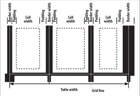
Figure 1-7. Collapsing cell borders model
The following describes the detailed process for aligning cell contents within a row:
There are a variety of value types in CSS, most of which use units. Combining basic value types (such as numbers) with units (such as pixels) makes it possible to do any number of interesting things with CSS.
Keywords are defined on a per-property basis and have a meaning specific only to a given property. For example, normal has totally unique meanings for the properties font- variant and letter-spacing. Keywords, like property names, are not case-sensitive.
CSS defines three "global" keywords that are accepted by every property in the specification:
Forces the value for the property to be inherited from the element's parent element, even if the property in question is not inherited (e.g., background-image). Another way to think of this is that the value is copied from the parent element.
Forces the value of the property to be the initial value defined by the relevant CSS module. For example, fontstyle: initial sets the value of font-style to normal regardless of the font-style value that would have been inherited from the parent element. In cases where the initial value is defined as determined by the user agent, such as for font-size, the value is set to the "default" defined by the user agent's preferences.
Combines the effects of both inherit and initial, with a rudimentary logic built in for good measure. If a property is inherited (e.g., color), then unset has the same effect as inherit. If the property is not inherited (e.g., backgroundimage), then unset has the same effect as initial.
If you have a situation where you want to set all of the properties on an element to their default values, thus breaking any chains of inheritance, see the all property in Chapter 4.
Color values can be expressed in a variety of ways:
This is a hex-pair notation familiar to authors using traditional HTML. In this format, the first pair of digits corresponds to the red level, the second pair to the green, and the third pair to the blue. Each pair is in hexadecimal notation in the range 00--FF (decimal 0--255). Thus, a "pure" blue is written #0000FF, a "pure" red is written #FF0000, and so on.
This is a shorter form of the six-digit notation described previously. In this format, each digit is replicated to arrive at an equivalent six-digit value; thus, #F8C becomes #FF88CC.
An extension of the #RRGGBB notation which adds an alpha channel. As with the R, G, and B values, the A (alpha) value is in hexadecimal notation in the range 00-- FF. These are mapped from hexadecimal to decimal in the range 0--1; thus, #00FF0099 is equivalent to the color #00FF00 (light green) with an opacity of 0.6. The opacity here is derived by converting hexadecimal 99 to decimal 153, and then dividing 153 by 255 to get 0.6. Put another way, #00FF0099 is exactly equivalent to rgba(0,255,0,0.6). Note: support for this notation first emerged in early 2016.
This is a shorter form of the eight-digit #RRGGBBAA notation described previously. In this format, each digit is replicated to arrive at an equivalent eight-digit value; thus, £F8C6 becomes #FF88CC66. Note: support for this notation first emerged in early 2016.
This format allows the author to use RGB values in the range 0--255; only integers are permitted. Not coincidentally, this range is the decimal equivalent of 00--FF in hexadecimal. In this format, "pure" green is rgb(0,255,0), and white is represented as rgb(255,255,255).
This format allows the author to use RGB values in the range 0% to 100%, with decimal values allowed (e.g., 75.5%). The value for black is thus rgb(0%,0%,0%), whereas "pure" blue is rgb(0%,0%,100%).
This format permits authors to specify a color by its hue angle, saturation, and lightness (HSL). The hue angle is always a unitless number or a <degree> value in the range 0 to 360, and the saturation and brightness values are always percentages. Hue angles 0 and 360 are equivalent, and are both red. Hue angles greater than 360 can be declared, but they are normalized to the 0--360 range; thus, setting a hue angle of 454 is equivalent to setting an angle of 94. Any HSL value, regardless of color angle, will be rendered as a shade of gray if the saturation value is 0%; the exact shade will depend on the lightness value. Any HSL value, regardless of the hue angle, will be rendered solid black if lightness is 0% and solid white if lightness is 100%. The "normal" lightness value---that is, the value associated with most common colors---is 50%.
These extend the previous three formats to include an alpha (opacity) value. The alpha value must be a real number between 0 and 1 inclusive; percentages are not permitted for the alpha value. Thus, rgba(255,0,0,0.5) and rgba(100%,0%,0%,0.5) and hsla(0,100%,50%,0.5) are all equivalent half-opaque red.
One of 16 recognized keywords based on the original Windows VGA colors. These keywords are aqua, black, blue, fuchsia, gray, green, lime, maroon, navy, olive, purple, red, silver, teal, white, and yellow. Browsers generally also recognize the 148 color keywords documented in the CSS Color Module Level 4 specification, referred to for historical reasons as "the X11 colors" (though the list does not precisely replicate X11's colors).
A special keyword that represents the current computed value of the element's color property. This means you can declare background-color: currentColor and set the element's background to be the same color as its foreground (not recommended). When applied to the color property, it is equivalent to declaring color: inherit. It can also be used on borders; border: 1px solid is equivalent to border: 1px solid currentColor. This can be quite useful when (un)setting a border's color via DOM scripting.
A special keyword that is (just barely) a shorthand for rgba(0,0,0,0), which is the computed value any time transparent is used.
A number value is expressed as a positive or negative number (when permitted). Numbers can be either real (represented as <number>) or integers (<integer>). They may also restrict the range of acceptable values, as with color values that accept only integers in the range 0--255. A more common range restriction is to limit a number to be non-negative. These are sometimes represented as <non-negative number> or <non-negative integer>.
A percentage value is expressed as a <number> followed immediately by a percent sign (%). There should never be any space between the number and the percent sign. A percentage value will always be computed relative to something else. For example, declaring font-size: 120% for an element sets its font size to 120% of the computed font-size of its parent element. Fractional values, such as 543.21%, are valid. Some properties may restrict percentage values to be non-negative.
A length value is expressed as a positive or negative number (when permitted), followed immediately by a unit identifier. There should never be any space between the number and the unit identifier. A length value of 0 (zero) does not require a unit identifier.
Length units are divided into two types: absolute units, which are (in theory) always measured in the same way, and relative units, which are measured in relation to other things.
The available absolute units are:
The centimeters found on rulers the world over. There are 2.54 centimeters to an inch, and 1 centimeter equals 0.394 inches. The same mapping warnings that applied to inches also apply to centimeters.
There are 10 millimeters to a centimeter, so you get 25.4 millimeters to an inch, and 1 millimeter equals 0.0394 inches. Bear in mind the previous warnings about mapping lengths. to displays.
Exactly what they say they are: one-fourth of a millimeter. In other words, 4q equals one millimeter, and 400q equals one centimeter. Again, bear in mind the previous mapping warnings.
As you might expect, the same inches found on typical US rulers. The mapping from inches to a display device is usually approximate at best, because many systems have no concept of the relation of their display areas to "realworld" measurements such as inches. Thus, inches should be used with extreme caution in screen design.
Points are standard typographical measures used by printers and typesetters for centuries and by word-processing programs for decades. By modern definition, there are 72 points to an inch. Therefore, the capital letters of text set to 12 points should be 1/6 of an inch tall. For example, p {font-size: 18pt;} is equivalent to p {font-size: 0.25in;}, assuming proper mapping of lengths to the display environment (see previous comments).
Another typographical term. A pica is equivalent to 12 points, which means there are 6 picas to an inch. The capital letters of text set to 1 pica should be 1/6 of an inch tall. For example, p {font-size: 1.5pc;} would set text to be the same size as the example declarations found in the definition of points. Keep in mind the previous warnings.
The available relative units are:
This refers to the em-height of a given font face. In CSS, the em-height is equivalent to the height of the character box for the font face, which is to say the computed value of font-size. Ems can be used to set relative sizes for fonts; for example, font-size: 1.2em is the same as saying fontsize: 120%.
Equal to the em-height of the root element (in HTML, the html element).
This refers to the x-height of the font face, which is to say the height of the lowercase "x" character in the given font face. However, the vast majority of font faces do not include their x-height, so many browsers approximate it (poorly) by simply setting 1ex to be equal to 0.5em.
This refers to the width of a single zero (Unicode U+0300, "ZERO") in the current font family and size. This is often, but erroneously, assumed to mean "one character." This will only be true in monospace fonts, where all characters are the same width.
Since most proportional fonts have zeros that are slimmer than the alphabetic symbols, setting something like width: 60ch will often result in lines of text with fewer than 60 characters.
A pixel is usually thought of as a small box on a display, but CSS defines pixels more abstractly. In CSS terms, a pixel is defined to be about the size required to yield 96 units per inch. Many user agents ignore this definition in favor of simply addressing the pixels on the display, but others (such as those on high-resolution mobile devices) go the CSS route, treating each px as being multiple physical on-screen pixels.
This unit is calculated with respect to the viewport's width, which is divided by 100. If the viewport is 937 pixels wide, for example, 1vw is equal to 9.37px. If the viewport's width changes, say by dragging the browser window to be wider or narrower, the value of vw changes along with it.
This unit is calculated with respect to the viewport's height, which is divided by 100. If the viewport is 650 pixels tall, for example, 1vh is equal to 6.5px. If the viewport's height changes, say by dragging the browser window to be taller or shorter, the value of vh changes along with it.
This unit is 1/100 of the viewport's width or height, whichever is lesser. Thus, given a viewport that is 937 pixels wide by 650 pixels tall, 1vmin is equal to 6.5px.
This unit is 1/100 of the viewport's width or height, whichever is greater. Thus, given a viewport that is 937 pixels wide by 650 pixels tall, 1vmax is equal to 9.37px.
A fraction value is a <number> followed by the label fr. Thus, one fraction unit is 1fr, four fraction units are 4fr, and so on. This is a concept introduced by Grid Layout, and is used to divide up fractions of the unconstrained space in a layout. Note that fr is not a <length> unit, and thus cannot be used in places where length values are permitted (e.g., calc() expressions, see "Calculation Values" on page 45).
A URI value (<uri>) is a reference to a file such as a graphic or another stylesheet. CSS defines a URI as relative to the stylesheet that contains it. URI stands for Uniform Resource Identifier, which is the more recent name for URLs. (Technically, URLs are a subset of URIs.) In CSS, which was first defined when URIs were still called URLs, this means that references to URIs will often appear in the form url(<uri>). Fun!
The format of an <angle> is expressed as a <number> followed immediately by an angle unit. There are four types of angle units: degrees (deg), grads (grad), radians (rad), and turns (turn). For example, a right angle could be declared as 90deg, 100grad, 1.571rad, or 0.25turn. In each case, the values are translated into degrees in the range 0 through 360. This is also true of negative values: −90deg is equivalent to 270deg.
A time value (<time>) is expressed as a <number> followed immediately by a time unit. There are two types of time units: seconds (s) and milliseconds (ms). Time values appear in aural styles, which are not widely supported, and in the much better supported transitions and animations.
A frequency value (<frequency>) is expressed as a non-negative <number> followed immediately by a frequency unit. There are two types of frequency units: hertz (Hz) and kilohertz (kHz).
The unit identifiers are case-insensitive, so 6kHz and 6khz are equivalent. As of this writing, frequency values are only used with aural styles, which are not well supported.
A position value (<position>) is how you specify the placement of an origin image in backgrounds, object fitting, masking placement, and a few other circumstances. Its syntactical structure is rather complicated:
[
[ left | center | right | top | bottom | <percentage> | <length> ] |
[ left | center | right | <percentage> | <length> ]
[ top | center | bottom | <percentage> | <length> ] |
[ center | [ left | right ] [ <percentage> | <length> ]? ] &&
[ center | [ top | bottom ] [ <percentage> | <length> ]? ]
]
That might seem a little convoluted and repetitive, but it's all down to the subtly complex patterns that this value type has to allow, such as center, bottom right, 50% center, left 77px, and so on. The notation used here is described in "Value Syntax Conventions" on page 73.
A string (<string>) is a series of characters enclosed by either single or double quotes. If a string needs to include the same quote that encloses it, it must be escaped. For example,
'That\'s amazing!' or "Deploy the \"scare quotes\" at once!". If a newline is needed within a string, it is represented as \A, which is the Unicode codepoint for the line feed character. Any Unicode character can be represented using an escaped codepoint reference; thus, a left curly double quotation mark can be represented with \201C. If a string does contain a line feed for legibility reasons, it must be escaped and will be removed when processing the string.
There are some properties that accept an identifier value, which is a user- defined label of some kind; the most common examples are grid lines and areas in grid layout and keyframe names in animations. Identifiers are represented in the value syntax as <identifier>. Identifiers are words and are case-sensitive; thus, myID and MyID are, as far as CSS is concerned, completely distinct and unrelated to each other. In cases where a property accepts both an identifier and one or more keywords, the author should take care to never define an identifier identical to a valid keyword.
In a few CSS properties, it's possible to pull in the value of an HTML attribute defined for the element being styled. This is done with the attr() value. As of early 2018, this is almost exclusively done with generated content, using the content property.
For example, h2::before {content: "[" attr(ID) "] ";} will insert an opening square bracket, the ID of the h2 element, and then a closing square bracket and trailing space. Any attribute, including HTML data-* attributes, can be addressed in this manner.
Calculation values take the form calc(), with an equation inside the parentheses. calc() can be used wherever <length>, <frequency>, <angle>, <time>, <percentage>, <number>, or <integer> values are allowed. You can also use all these units.
Identifiers
types within a calc() value, though there are some limitations to keep in mind.
Inside the parentheses, you can construct simple mathematical expressions. The permitted operators are + (addition), -- (subtraction), * (multiplcation), and / (division), as well as parentheses. These follow the traditional PEMDAS (parentheses, exponents, multiplication, division, addition, subtraction) precedence order---although in this case it's really just PMDAS, since as of early 2018, exponents are not permitted in calc().
The basic limitation is that calc() does simple type-checking to make sure that units are compatible:
There's one more notable limitation: whitespace is required to either side of the + and - operators, while it is not for * and /. This avoids ambiguity with respect to numeric values, which can be negative.
As this book was being finished in early 2018, a new capability was being added to CSS. The technical term for this is custom properties, even though what these really do is create (sort of) variables in your CSS. They do not, contrary to their name, create special CSS properties, in the sense of properties like color or font.
Custom properties are defined by giving a custom identifier a value, like this:
html {
  ‐-mainColor: #AEA434;
}
The important thing is that any custom identifier of this type begins with two hyphens (‐-). Anything else, and the identifier will not be recognized, meaning the variable definition will fail.
The defined value can then be invoked later on using a var() value type, like this:
h1 {color: var(‐-mainColor);}
Note that these names are case-sensitive, so ‐-maincolor and ‐-MainColor are completely separate identifiers. Custom properties are scoped to the element to which they are applied.
| Universal Selector | |
|---|---|
| Pattern | * |
| Description | Matches any element name in the document's language. If a rule does not have an explicit selector, the universal selector is inferred. |
| Examples | * {color: red } |
| Type Selector | |
|---|---|
| Pattern | element1 |
| Description | Matches the name of an element in the document's language. Every instance of the element name is matched. (CSS1 referred to these as "element selectors."). |
| Examples | body {background: #FFF;} |
| Descendant Selector | |
|---|---|
| Pattern | element1 element2 ... | Description | Matches elements based on their status as a descendant of another element. The matched element can be a child, grandchild, great-grandchild, etc. of the ancestor element. (CSS1 referred to these as "contextual selectors.") |
| Examples |
body h1 {font-size: 200%;}
table tr td div ul li {color:purple;} element1 > element2
|
| Child Selector | |
|---|---|
| Pattern | element1 > element2 | Description | Matches an element based on its status as a child of another element. It is more restrictive than a descendant selector, as only a child will be matched. |
| Examples |
div > p {color: cyan;}
ul > li {font-weight: bold;}
|
| Adjacent Sibling Selector | |
|---|---|
| Pattern | element1 + element2 | Description | Matches an element that is the following adjacent sibling of another element. (Sibling elements, as the name implies, share the same parent element.) Any anonymous text nodes between the two elements are ignored; only elements and their positions in the document tree are considered. |
| Examples |
table + p {margin-top: 2.5em;}
h1 + * {margin-top: 0;}
|
| General Sibling Selector | |
|---|---|
| Pattern | element1 ~ element2 | Description | Matches an element that is a sibling of another element which it follows in the document tree. Any text or other elements between the two elements are ignored; only the elements and their positions in the document tree are considered. |
| Examples |
table + p {margin-top: 2.5em;}
h1 + * {margin-top: 0;}
|
| Class Selector | |
|---|---|
| Pattern | element1.classname element1.classname1.classname2 |
Description | In languages that permit it, such as HTML, SVG, and MathML, a class selector using "dot notation" matches elements that have a class attribute containing a specific value or values. The name of the class value must immediately follow the dot. Multiple class values can be chained together. If no element name precedes the dot, the selector matches all elements bearing that class value or values. |
| Examples |
p.urgent {color: red;}
a.external {font-style: italic;}
.example {background: olive;}
.note.caution {background: yellow;}
|
| ID Selector | |
|---|---|
| Pattern | element1#idname | Description | In languages that permit it, such as HTML or SVG, an ID selector selects elements that have an id attribute containing a specific value. The name of the ID value must immediately follow the octothorpe (#). If no element name precedes the octothorpe, the selector matches all elements containing that ID value. |
| Examples |
h1#page-title {font-size: 250%;}
body#home {background: silver;}
#example {background: lime;}
|
| Simple Attribute Selector | |
|---|---|
| Pattern | element1[attr] | Description | Matches elements based on the presence of an attribute, regardless of the attribute's value. |
| Examples |
a[rel] {border-bottom: 3px double gray;}
p[class] {border: 1px dotted silver;}
|
| Exact Attribute Value Selector | |
|---|---|
| Pattern | element1[attr="value"] | Description | Matches elements based on the precise and complete value of an attribute. |
| Examples |
a[rel="start"] {font-weight: bold;}
p[class="urgent"] {color: red;}
|
| Partial Attribute Value Selector | |
|---|---|
| Pattern | element1[attr~="value"] |
| Description | Matches elements based on a portion of the spaceseparated value of an attribute. Note that [class~="value"] is equivalent to .value (see above). |
| Examples |
a[rel~="friend"] {text-transform: uppercase;}
p[class~="warning"] {background: yellow;}
|
| Beginning Substring Attribute Value Selector | |
|---|---|
| Pattern | element1[attr^="substring"] |
| Description | Matches elements based on a substring at the very beginning of an attribute's value. |
| Examples |
a[href^="/blog"] {text-transform: uppercase;}
p[class^="test-"] {background: yellow;}
|
| Ending Substring Attribute Value Selector | |
|---|---|
| Pattern | element1[attr$="substring"] |
| Description | Matches elements based on a substring at the very end of an attribute's value. |
| Examples |
a[href$=".pdf"] {font-style: italic;}
|
| Arbitrary Substring Attribute Value Selector | |
|---|---|
| Pattern | element1[attr*="substring"] |
| Description | Matches elements based on a substring found anywhere within an attribute's value. |
| Examples |
a[href*="oreilly.com"] {font-weight: bold;}
div[class*="port"] {border: 1px solid red;}
|
| Language Attribute Selector | |
|---|---|
| Pattern | element1[lang|="language-identifier"] |
| Description | Matches elements with a lang attribute whose value is one of a hyphen-separated list of values, starting with the value provided in the selector. In an HTML document, the language of an element is determined by its lang attribute. If an element does not have one, its language is determined by the lang attribute of its nearest ancestor that does have one, or, lacking that, by the Content-Language HTTP header response field (or the respective meta http-equiv) for the document. |
| Examples |
html[lang|="tr"] {color: red;}
|
Strictly speaking, all pseudo-classes (like all selectors) are structural: they are, after all, dependent on document structure in some fashion. What sets the pseudo-classes listed here apart is that they are intrinsically about patterns found in the structure of the document: for example, selecting every other paragraph or elements that are the last children of their parent element.
| :empty | |
|---|---|
| Applies to | Any element |
| Description | Matches elements that have no child nodes---that is, no child elements or content nodes. Content nodes are defined as any text, whitespace, entity reference, or CDATA nodes. Thus, <p> </p> is not empty because it has a single whitespace character inside it; nor is the element empty if that space is replaced with a newline. Note that this pseudo-class does not apply to empty elements such as <br>, <img>, <input>, and so on. |
| Examples |
p:empty {padding: 1em; background: red;}
div:not(:empty) {border: 1px solid;
|
| :first-child | |
|---|---|
| Applies to | Any element |
| Description | Matches an element when it is the first child of another element. Thus, div:first-child will select any div that is the first child of another element, not the first child element of any div. |
| Examples |
td:first-child {border-left: 1px solid;}
p:first-child {text-indent: 0; margin-top: 2em;}
|
| :first-of-type | |
|---|---|
| Applies to | Any element |
| Description | Matches an element when it is the first child of its type, as compared to all its sibling elements. Thus, div:first-of-type will select any div that is the first child div of another element. |
| Examples |
td:first-of-type {border-left: 1px dotted;}
h2:first-of-type {color: fuchsia;}
|
| :lang | |
|---|---|
| Applies to | Any element with associated language-encoding information. |
| Description | Matches elements based on their human-language encoding. Such language information must be contained within, or otherwise associated with, the document---it cannot be assigned from CSS. The handling of :lang is the same as for |= attribute selectors. |
| Examples |
html:lang(en) {background: silver;}
|
| :last-child | |
|---|---|
| Applies to | Any element |
| Description | Matches an element when it is the last child of another element. Thus, div:last-child will select any div that is the last child of another element, not the last child element of any div. |
| Examples |
td:last-child {border-right: 1px solid;}
p:last-child {margin-bottom: 2em;}
|
| :last-of-type | |
|---|---|
| Applies to | Any element |
| Description | Matches an element when it is the last child of its type, as compared to all its sibling elements. Thus, div:last-of-type will select any div that is the last child div of another element. |
| Examples |
td:last-of-type {border-right: 1px dotted;}
h2:last-of-type {color: fuchsia;}
|
| :nth-child(an±b) | |
|---|---|
| Applies to | Any element |
| Description | Matches every nth child with the pattern of selection defined by the formula an±b, where a and b are <integer>s and n represents an infinite series of integers, counting forward from the first child. Thus, to select every fourth child of the body element, starting with the first child, you would write body > *:nth-child(4n+1). This will select the first, fifth, ninth, fourteenth, and so on children of the body. If you literally wish to select the fourth, eighth, twelfth, and so on children, you can modify the selector to body > *:nth-child(4n). It is also possible for b to be negative: body > *:nth-child(4n-- 1) selects the third, seventh, eleventh, fifteenth, and so on children of the body. In place of the an±b formula, there are two keywords permitted: even and odd. These are equivalent to 2n and 2n+1, respectively. |
| Examples |
*:nth-child(4n+1) {font-weight: bold;}
tbody tr:nth-child(odd) {background-color: #EEF;}
|
| :nth-last-child(an±b) | |
|---|---|
| Applies to | Any element |
| Description | Matches every nth child with the pattern of selection defined by the formula an±b, where a and b are <integer>s and n represents an infinite series of integers, counting backward from the last child. Thus, to select every fourth-to-last child of the body element, starting with the last child, you would write body > *:nth-last-child(4n+1). This is, in effect, the mirror image of :nth-child. In place of the an±b formula, there are two keywords permitted: even and odd. These are equivalent to 2n and 2n+1, respectively. |
| Examples |
*:nth-last-child(4n+1) {font-weight: bold;}
tbody tr:nth-last-child(odd) {
  background-color: #EEF;}
|
| :nth-last-of-typean±b) | |
|---|---|
| Applies to | Any element |
| Description | Matches every nth child that is of the same type as the element named, with the pattern of selection defined by the formula an±b, where a and b are <integer>s and n represents an infinite series of integers, counting backward from the last such element. Thus, to select every third-to-last paragraph (p) that is a child of the body element, starting with the first such paragraph, you would write body > p:nthlast-of-type(3n+1). This holds true even if other elements (e.g., lists, tables, or other elements) are interspersed between the various paragraphs. In place of the an±b formula, there are two keywords permitted: even and odd. These are equivalent to 2n and 2n+1, respectively. |
| Examples |
td:nth-last-of-type(even) {
  background-color: #FCC;}
img:nth-last-of-type(3n) {float: left;
  border: 2px solid;}
|
| :nth-of-type(an±b) | |
|---|---|
| Applies to | Any element |
| Description | Matches every nth child that is of the same type as the element named, with the pattern of selection defined by the formula an±b, where a and b are <integer>s and n represents an infinite series of integers, counting forward from the first such element. Thus, to select every third paragraph (p) that is a child of the body element, starting with the first such paragraph, you would write body > p:nth-oftype(3n+1). This will select the first, fourth, seventh, tenth, and so on child paragraphs of the body. This holds true even if other elements (e.g., lists, tables, or other elements) are interspersed between the various paragraphs. In place of the an±b formula, there are two keywords permitted: even and odd. These are equivalent to 2n and 2n+1, respectively. |
| Examples |
td:nth-of-type(even) {background-color: #FCC;}
img:nth-of-type(3n) {float: right;}
|
| :only-child | |
|---|---|
| Applies to | Any element |
| Description | Matches an element that is the only child element of its parent element. A common use case for this selector is to remove the border from any linked image, assuming that image is the only element in the link. Note that an element can be selected by :only-child even if it has its own child or children. It must simply be the only child of its parent. |
| Examples |
a img:only-child {border: 0;}
table div:only-child {margin: 5px;}
|
| only-of-type | |
|---|---|
| Applies to | |
| Description | Matches an element that is the only child element of its type of its parent element. Note that an element can be selected by :only-of-type even if it has its own child or children of its own type (such as divs within a div). |
| Examples |
p em:only-of-type {font-weight: bold;}
section article:only-of-type {margin: 2em 0 3em;}
|
| :root | |
|---|---|
| Applies to | The root element |
| Description | This matches the document's root element, which in HTML is always the html element. In SVG, it is the svg element. In XML formats, the root element can have any name; thus, a generic root-element selector is needed. |
| Examples |
:root {font: medium serif;}
|
There is but one pseudo-class that handles negation, but it is so unique that it deserves its own subsection.
:not(e)
Applies to Any element
Description Matches every element that is not described by the simple selector e. For example, you can select every element that is not a paragraph by stating *:not(p).
More usefully, negation can be used within the context of descendant selectors. An example of this would be selecting every element within a table that is not a data cell using table *:not(td).
Another example would be selecting every element with an ID that is not search by using [id]:not([id="search"]).
Note that there is one exception to the "simple selector" definition of e: it cannot be a negation pseudoclass itself. That is, it is impermissible to write :not(:not(div)).
Because :not() is a pseudo-class, it can be chained with other pseudo-classes as well as with instances of itself. For example, to select any focused element that isn't an a element, use *:focus:not(a). To select any element that isn't either a paragraph or a section, use *:not(p):not(section).
As of early 2018, the "simple selector" restriction means that grouped, descendant, and combined selectors are not permitted within :not() expressions. This restriction is being loosened in CSS Selectors Level 4.
Examples
ul *:not(li) {text-indent: 2em;}
*:not([type="checkbox"]):not([type="radio"]) {
  margin: 0 1em;}
The pseudo-classes listed here are all related to the user's interaction with the document: whether styling different link states, highlighting an element that's the target of a fragment identifier, or styling form elements based on their being enabled or disabled.
| :active | |
|---|---|
| Applies to | Any interaction element |
| Description | Matches an element during the period in which it is being activated. The most common example is clicking on a hyperlink in an HTML document: while the mouse button is being held down, the link is active. There are other ways to activate elements, and other elements can in theory be activated, although CSS doesn't define them. |
| Examples |
a:active {color: red;}
*:active {background: blue;}
|
| :active | |
|---|---|
| Applies to | Any interaction element that has an on/off state |
| Description | Matches any user interface element that has been "toggled on," such as a checked checkbox or a filled radio button. |
| Examples |
input:checked {
 outline: 3px solid rgba(127,127,127,0.5);}
input[type="checkbox"]:checked {
  box-shadow: red 0 0 5px;}
|
| :disabled | |
|---|---|
| Applies to | Any interaction element |
| Description | Matches user interface elements that are not able to accept user input because of language attributes or other nonpresentational means; for example, <input type="text" disabled> in HTML5. Note that :disabled does not apply when an input element has simply been removed from the viewport with properties like position or display. |
| Examples |
input:disabled {opacity: 0.5;}
|
| :enabled | |
|---|---|
| Applies to | Any interaction element |
| Description | Matches user interface elements that are able to accept user input and that can be set to "enabled" and "disabled" states through the markup language itself. This includes any form input element in (X)HTML, but does not include hyperlinks. |
| Examples |
input:enabled {background: #FCC;}
|
| :focus | |
|---|---|
| Applies to | Any interaction element |
| Description | Matches an element during the period in which it has focus. One example from HTML is an input box that has the text-input cursor within it such that when the user starts typing, text will be entered into that box. Other elements, such as hyperlinks, can also have focus; however, CSS does not define which elements may or may not have focus. |
| Examples |
a:focus {outline: 1px dotted red;}
input:focus {background: yellow;}
|
| :hover | |
|---|---|
| Applies to | Any interaction element |
| Description | Matches an element during the period in which it is being hovered over (when the user is designating an element without activating it). The most common example of this is moving the mouse pointer inside the boundaries of a hyperlink in an HTML document. Other elements can in theory be hovered over, although CSS doesn't define which ones. |
| Examples |
a[href]:hover {text-decoration: underline;}
p:hover {background: yellow;}
|
| :link | |
|---|---|
| Applies to | A hyperlink to a resource that has not been visited |
| Description | Matches a link to a URI that has not been visited; that is, the URI to which the link points does not appear in the user agent's history. This state is mutually exclusive with the :visited state. |
| Examples |
a:link {color: blue;}
*:link {text-decoration: underline;}
|
| :target | |
|---|---|
| Applies to | Any elements |
| Description | Matches an element which is itself matched by the fragment identifier portion of the URI used to access the page. Thus, http://www.w3.org/TR/ css3-selectors/#target-pseudo would be matched by :target and would apply the declared styles to any element with the id of target-pseudo. If that element was a paragraph, it would also be matched by p:target. |
| Examples |
:target {background: #EE0;}
|
| :visited | |
|---|---|
| Applies to | A hyperlink to a resource that has already been visited |
| Description | Matches a link to a URI that has been visited; that is, the URI to which the link points appears in the user agent's history. This state is mutually exclusive with the :link state. |
| Examples |
a:visited {color: purple;}
*:visited {color: gray;}
|
| ::after | |
|---|---|
| Generates | A pseudo-element containing generated content placed after the content in the element |
| Description | Inserts generated content at the end of an element's content. By default, the pseudo-element is inline, but this can be changed using the property display. | In CSS1 and CSS2, pseudo-elements were preceded by single colons, just as pseudo- classes were. In CSS3 and later, pseudoelements use double colons to distinguish them from pseudoclasses. For historical reasons, browsers will support both single and double colons on pseudo-elements, but the doublecolon syntax is recommended.
| Examples |
a.external:after {
  content: " " url(/icons/globe.gif);}
p:after {content: " |; ";}
|
| ::before | |
|---|---|
| Generates | A pseudo-element containing generated content placed before the content in the element |
| Description | Inserts generated content at the beginning of an element's content. By default, the pseudo-element is inline, but this can be changed using the property display. |
| Examples |
a[href]:before {content: "[LINK] ";}
p:before {content: attr(class);}
a[rel|;="met"]:after {content: " *";}
|
| ::first-letter | |
|---|---|
| Generates | A pseudo-element that contains the first letter of an element |
| Description | Styles the first letter of an element. Any leading punctuation should be styled along with the first letter. Some languages have letter combinations that should be treated as a single character, and a user agent may apply the first letter style to both. Prior to CSS2.1, ::first-letter could be attached only to block- level elements. CSS2.1 expanded its scope to include elements with a display value of block, list-item, table-cell, table-caption, or inlineblock. There is a limited set of properties that can apply to a first letter. |
| Examples |
h1:first-letter {font-size: 166%;}
p:first-letter {text-decoration: underline;}
|
| ::first-line | |
|---|---|
| Generates | A pseudo-element that contains the first formatted line of an element. |
| Description | Styles the first line of text in an element, regardless of how many or how few words may appear in that line. ::first-line can be attached only to blocklevel elements. There is a limited set of properties that can apply to a first line. |
| Example |
p.lead:first-line {font-weight: bold;}
|
With media queries, an author can define the media environment in which a given stylesheet, or portion of a stylesheet, is used by the browser. In the past, this was handled by setting media types with the media attribute on link elements, or with the media descriptor on @import declarations. Media queries take this concept several steps further by allowing authors to choose stylesheets based on the features of a given media type.
The placement of media queries will be very familiar to any author who has ever set a media type. Here are two ways of applying an external stylesheet when rendering the document on a color printer:
<link href="print-color.css" type="text/css" media="print and
(color)" rel="stylesheet">


@import url(print-color.css) print and (color);
Anywhere a media type can be used, a media query can be used. This means that it is possible to list more than one query in a comma-separated list:
<link href="print-color.css" type="text/css" media="print and
(color), projection and (color)" rel="stylesheet">


@import url(print-color.css) print and (color), projection and
(color);
In any situation where one of the media queries evaluates to true, the associated stylesheet is applied. Thus, given the previous @import, print-color.css will be applied if rendering to a color printer or a color projection environment. If printing on a black-and-white printer, both queries will evaluate to false and print-color.css will not be applied to the document. The same holds for any screen medium, a grayscale projection environment, an aural media environment, and so forth.
Each query is composed of a media type and one or more listed media features. Each media feature is enclosed in parentheses, and multiple features are linked with the and keyword. There are two logical keywords in media queries: and links together two or more media features in such a way that all of them must be true for the query to be true. For example, (color) and (orientation: landscape) and (min-device-width: 800px) means that all three conditions must be satisfied: if the media environment has color, and is in landscape orientation, and the device's display is at least 800 pixels wide, the stylesheet is used.
Negates the entire query so that if all of the conditions are true, the stylesheet is not applied. For example, not (color) and (orientation: landscape) and (mindevice-width: 800px) means that if the three conditions are satisfied, the statement is negated. Thus, if the media environment has color, and is in landscape orientation, and the device's display is at least 800 pixels wide, the stylesheet is not used. In all other cases, it will be used. Note that the not keyword can only be used at the beginning of a media query. It is not legal to write something like (color) and not (min-device-width: 800px). In such cases, the query will be ignored. Note also that browsers too old to understand media queries will always skip a stylesheet whose media descriptor starts with not.
There is no or keyword for use within a given query, but the commas that separate a list of queries serve the function of an or; that is, screen, print means "apply if the media is screen or print." Thus, instead of screen and (max-color: 2) or (monochrome), which is invalid and thus ignored, you should write screen and (max-color: 2), screen and (monochrome).
There is one more keyword, only, which is designed to create deliberate backward incompatibility.
Used to hide a stylesheet from browsers too old to understand media queries. For example, to apply a stylesheet in all media, but only in those browsers that understand media queries, you would write something like @import url(new.css) only all. In browsers that do understand media queries, the only keyword is ignored. Note that the only keyword can be used only at the beginning of a media query.
There are two new value types introduced by media queries, which (as of early 2018) are not used in any other context:
A ratio value is two positive <integer> values separated by a solidus (/) and optional whitespace. The first value refers to the width, and the second to the height. Thus, to express a width-to-height ratio of 16:9, you can write 16/9 or 16 / 9.
A resolution value is a positive <integer> followed by either of the unit identifiers dpi or dpcm. As usual, whitespace is not permitted between the <integer> and the identifier.
As of early 2018, the available media features are as follows. Note that their values cannot be negative:
Refers to the width of the display area of the user agent. In a screen-media web browser, this is the width of the viewport plus any scrollbars. In paged media, this is the width of the page box. Thus, (minwidth: 850px) applies when the viewport is greater than 850 pixels wide.
Refers to the width of the complete rendering area of the output device. In screen media, this is the width of the screen. In paged media, this is the width of the page. Thus, (max-device-width: 1200px) applies when the device's output area is less than 1,200 pixels wide.
Refers to the height of the display area of the user agent. In a screen-media web browser, this is the height of the viewport plus any scrollbars. In paged media, this is the height of the page box. Thus, (height: 567px) applies when the viewport's height is precisely 567 pixels tall.
Refers to the height of the complete rendering area of the output device. In screen media, this is the height of the screen. In paged media, this is the height of the page. Thus, (max-device-height: 400px) applies when the device's output area is less than 400 pixels tall.
Refers to the ratio that results from comparing the width media feature to the height media feature (see the definition of <ratio>). Thus, (min-aspect-ratio: 2/1) applies to any viewport whose width-to-height ratio is at least 2:1.
Refers to the ratio that results from comparing the device-width media feature to the device-height media feature (see the definition of <ratio>). Thus, (device- aspect-ratio: 16/9) applies to any output device whose display area width-to-height ratio is exactly 16:9.
Refers to the presence of color-display capability in the output device, with an optional number representing the number of bits used in each color component. Thus, (color) applies to any device with any color depth at all, whereas (min-color: 4) means there must be at least four bits used per color component. Any device that does not support color will return 0.
Refers to the total number of colors available in the output device's color lookup table. Thus, (min-colorindex: 256) applies to any device with a minimum of 256 colors available. Any device that does not use a color lookup table will return 0.
Refers to the presence of a monochrome display, with an optional number of bits per pixel in the output device's frame buffer. Thus, (monochrome) applies to any monochrome output device, whereas (minmonochrome: 2) applies to any monochrome output device with a minimum of two bits per pixel in the frame buffer. Any device that is not monochrome will return 0.
Refers to the resolution of the output device in terms of pixel density, measured in either dots per inch (dpi) or dots per centimeter (dpcm). If an output device has pixels that are not square, the least dense axis is used; for example, if a device is 100dpcm along one axis and 120dpcm along the other, 100dpcm is the value returned. Additionally, a bare resolution feature query can never match (though min-resolution and max-resolution can).
Refers to the output device's total output area, where portrait is returned if the media feature height is equal to or greater than the media feature width. Otherwise, the result is landscape.
Refers to the scanning process used in an output device with a media type of tv.
Refers to the presence (or absence) of a grid-based output device, such as a tty terminal. A grid-based device will return 1; otherwise, 0 is returned.
A feature query is an at-rule block similar to a media query. The difference is that it queries a user agent about its support for a given property-value combination. If the user agent indicates it supports the query, the rules within the at-block are applied. Otherwise, they are ignored.
A basic example is to ask the browser if it supports backgroundcolor: red:
@supports (background-color: red) { html {background-color: yellow;} body {background-color: white;} } There is no obligation to use the property-value combination in the query in the subsequent rules. In fact, there's no obligation even to use the property that was part of the feature query. You can ask if a browser supports color: #FFF and then write rules that never touch color. (But just because you can doesn't mean you should.) Feature queries are useful when applying advanced CSS features. For example, converting a float-based layout to grid might look something like this:
[...float layout rules here...]
@supports (display: grid) {
  [...grid layout rules here...]
  [...rules that turn off margins, clearing,
  and other rules needed for float layout
  but not in grid layout...] }
It's also possible to do a negated feature query using the keyword not:
@supports not (shape-outside: circle()) {
  [...rules for use in browsers that
  don't understand
  circle float shapes...] }
Feature Queries
Each property listed in this chapter has "Inh." and "Anim." values. The values "N" (for no) and "Y" (for yes) indicate whether a property is inherited by descendant elements and whether the property is animatable, or able to be affected using the various animation and transition properties. In cases where only some of a property's values are animatable, the value given will be "P" (for partial) and more details will be given in the property's definition.
Any words presented in constant width are keywords that must appear literally, without quotes. The forward slash (/) and the comma (,) must also be used literally.
Any italicized words between "<" and ">" give a type of value, or a reference to another property's values. For example, the property font accepts values that originally belong to the property font-family. This is denoted by using the text <fontfamily>. Similarly, if a value type like a color is permitted, it will be represented using <color>.
There are a number of ways to combine components of a value definition:
Any user agent that has fully implemented the Cascading and Inheritance module will honor the following values for all properties. Think of it as a given property's value syntax being written something like:
These three keywords are not listed in the following property definitions, for purposes of clarity. The exception is the property all, which accepts only these three keywords as values. For definitions of these keywords' meaning, see Chapter 2.
| align-content | Inh. N Anim. N |
|---|---|
| Values | flex-start | flex-end | center | space-between | space-around | space-evenly | stretch |
| Initial value | stretch |
| Computed value | As declared |
| Applies to | Flex containers |
| Description | Defines the distribution of flex lines along the cross axis of a flex container, given that the container's cross-axis length does not equal the sum of the flex lines' size along the same axis. |
| Examples |
aside {display: flex; align-content: center;}
|
| Note | As of early 2018, there are plans to have this property apply to many (or all) elements, not just flex flex containers, and be given the values start and end to replicate replicate flex-start and flex-end behavior for non-flex environments. Thanks to the center value, this change would make vertical centering of content trivial in nearly all cases. |
| align-items | Inh. N Anim. N |
|---|---|
| Values | flex-start | flex-end | center | baseline | stretch |
| Initial value | stretch |
| Computed value | As declared |
| Applies to | Flex containers, grid containers, and multicolumn containers |
| Description | Sets a flex-container-wide default for items' alignment with respect to the cross axis of the flex line they occupy. baseline alignment means the items in a line are all placed such that the baselines of their first lines of text line up. |
| Examples |
div.flexy {align-items: flex-start;}
section.gallery {align-items: baseline;}
|
| Note | As of early 2018, there are plans to have this property apply to many (or all) elements and be given the values start and end to replicate flex-start and flex-end behavior for non- flex environments. |
| align-self | Inh. N Anim. N |
|---|---|
| Values | flex-start | flex-end | center | baseline | stretch |
| Initial value | stretch |
| Computed value | As declarede |
| Applies to | Flex and grid items |
| Description | Sets the alignment for a single item with respect to the cross axis of the flex line it occupies. |
| Examples |
div.flexy .midpointed {align-self: center;}
section.gallery h1 {align-self: stretch;}
|
| Note | As of early 2018, there are plans to have this property apply to many (or all) elements, and be given the values start and end to replicate flex-start and flex-end behavior for non-flex environments. |
| all | Inh. N Anim. N |
|---|---|
| Value | inherit | initial | unset |
| Initial value | See individual properties |
| Computed value | As declared |
| Applies to | All elements |
| Description | Applies the declared value to all properties except direction and unicode-bidi, which are exempted for accessibility and historical reasons. This allows an author to, for example, force an element to reset all of its style properties to their default values, thus blocking the inheritance of values for all properties (except the exempted two). |
| Examples |
*.blendin {all: inherit;}
*.embedded {all: unset;}
|
| animation | Inh. N Anim. N |
|---|---|
| Values | [ <animation-name> ‖ <animation-duration> ‖ <animation-timing-function> ‖ <animation-delay> ‖ <animation-iteration-count> ‖ <animationdirection> ‖ <animation-fill-mode> ‖ <animationplay-state> ]# |
| Initial value | 0s ease 0s 1 normal none running none |
| Computed value | As declared |
| Applies to | All elements, ::before and ::after pseudoelements |
| Description | A shorthand property encompassing all the aspects of one or more comma-separated CSS animations. The parts of the value can occur in any order. Therefore, beware possible ambiguity in the delay and duration values. As of this writing, it is most likely that the first time value will be taken to define the duration and the second to define the delay, but this cannot be guaranteed. |
| Examples |
div#slide {animation: 'slide' 2.5s linear
0 1 normal;}
h1 {animation: 'bounce' 0.5s 0.33s ease-in-out infinite alternate;}
|
| animation-delay | Inh. N Anim. N |
|---|---|
| Values | <time># |
| Initial value | 0s |
| Computed value | As declared |
| Applies to | All elements, ::before and ::after pseudoelements |
| Description | Defines the amount of time that the user agent waits before starting the CSS animation(s). The timer starts when the user agent applies the animation CSS. For a noninteractive element, this is likely (but not guaranteed) to be at the end of page load. |
| Examples |
body {animation-delay: 1s, 2000ms, 4s;}
a:hover {animation-delay: 400ms;}
|
| animation-direction | Inh. N Anim. N |
|---|---|
| Values | [ normal | reverse | alternate | alternatereverse ]# | Initial value | normal | Computed value | As declared | Applies to | All elements, ::before and ::after pseudoelements |
| Description | Specifies whether a CSS animation with more than one cycle (see animation-iteration-count) should always go the same direction or should reverse direction on every other cycle. For example, an alternate animation that moves an element 300 pixels to the right would move it 300 pixels to the left on every other cycle, thus returning it to its starting position. Setting that same animation to normal would cause the element to move 300 pixels right, then jump back to its starting place and move 300 pixels right again, over and over until the animation stops (assuming it ever does). |
| Examples |
body
{animation-direction:
alternate, normal, normal;} #scanner {animation-direction: normal;}
|
| animation-duration | Inh. N Anim. N |
|---|---|
| Values | <time># |
| Initial value | 0s |
| Computed value | As declared |
| Applies to | All elements, ::before and ::after pseudoelements |
| Description | Defines the length of time it should take for each cycle of a CSS animation to run from start to finish. Therefore, in animations with only one cycle, it defines the total time of the animation. The default value, 0s, means that there will be no animation besides moving the element from its start state to its end state. Negative values are converted to 0s. |
| Examples |
h1 {animation-duration: 10s, 5s, 2.5s, 1250ms;}
.zip {animation-duration: 90ms;}
|
| animation-iteration-count | Inh. N Anim. N |
|---|---|
| Values | [ <number> | infinite ]# |
| Initial value | 1 |
| Computed As value | As declared |
| Applies to | All elements, ::before and ::after pseudoelements |
| Description | Defines the number of cycles in the animation(s). The default value, 1, means that the animation will run exactly once, going from the start state to the end state. A fractional value (e.g., 2.75) means the animation will be halted midway through its final cycle. A value of 0 means that there will be no animation; negative values are converted to 0. As its name implies, infinite means the animation will never end. Use with caution. |
| Examples |
body {animation-iteration-count: 2, 1, 7.5875;}
ol.dance {animation-iteration-count: infinite;}
|
| animation-name | Inh. N Anim. N |
|---|---|
| Values | [ <single-animation-name> | none ]# |
| Initial value | none |
| Computed As value | As declared |
| Applies to | All elements, ::before and ::after pseudoelements |
| Description | Defines the declared name(s) of CSS animation(s). Each name refers to a CSS animation keyframe atrule. If no animation name is declared or the keyword none is supplied, the animation is not run regardless of the values of any other animation properties. For example, given animation-name: bounce, none, jumper and that the animation name jumper has not been defined, the first animation will run but the second and third will not. |
| Examples |
html {animation-name: turn, slide, none;}
h2 {animation-name: flip;}
|
| animation-play-state | Inh. N Anim. N |
|---|---|
| Values | [ running | paused ]# |
| Initial value | running |
| Computed value | As declared |
| Applies to | All elements, ::before and ::after pseudoelements |
| Description | Defines the run state of one or more CSS animations. The default state of running is the most useful in static CSS environments, but it can be used to easily stop or start animations via DOM scripting or interactive CSS (e.g., :hover). |
| Examples |
pre {animation-play-state:
running, paused, running;} table {animation-play-state: running;}
|
| animation-timing-function | Inh. N Anim. N |
|---|---|
| Values | [ ease | linear | ease-in | ease-out | ease-in-out | step-start | step-end | steps(<integer>, start) | steps(<integer>, end) | cubic-bezier(<number>, <number>,<number>,<number>) ]# |
| Initial value | ease |
| Computed value | As declared |
| Applies to | All elements, ::before and ::after pseudo elements |
| Description | Defines how an animation is run over the course of the animation's full cycle or within an individual keyframe, depending on where the property is used. The keywords are all defined to have cubicbezier() equivalents; for example, linear is equivalent to cubic-bezier(0,0,1,1). They should therefore have consistent effects across user agents ---but, as always, authors are cautioned not to count on that. |
| Examples |
h1 {animation-timing-function: ease, ease-in,
cubic-bezier(0.13,0.42,0.67,0.75)} p {animation-timing-function:
linear;}
|
| backface-visibility | Inh. N Anim. N |
|---|---|
| Values | visible | hidden |
| Initial value | visible |
| Computed value | As declared |
| Applies to | Any transformable element |
| Description | Defines whether the back side of an element is visible once the element has been rotated in a simulated 3D space and is "facing away" from the viewer. If the value is hidden, the element will be effectively invisible until it is rotated such that the front side of the element is once more "facing toward" the viewer. |
| Examples |
div.card {backface-visibility: hidden;}
span.cubeside {backface-visibility: visible;}
|
| background | Inh. N Anim. P |
|---|---|
| Values | [ <bg-layer>, ]* <final-bg-layer> |
| Initial value | Refer to individual properties |
| Computed value | Refer to individual properties |
| Applies to | All elements |
| Animatable | Refer to individual background properties to see which are animatable |
| Description | A shorthand way of expressing the various background properties of one or more element backgrounds using a single declaration. As with all shorthands, this property will set all of the allowed values (e.g., the repeat, position, and so on) to their defaults if the values are not explicitly supplied. Thus, the following two rules will have the same appearance: background: yellow; background: yellow none top left repeat; Furthermore, these defaults can override previous declarations made with more specific background properties. For example, given the following rules: h1 {background-repeat: repeat-x;} h1, h2 {background: yellow url(headback.gif);} the repeat value for both h1 and h2 elements will be set to the default of repeat, overriding the previously declared value of repeat-x. When declaring multiple backgrounds, only the last may have a background color. In cases where multiple background images overlap, the images are stacked with the first highest and the last lowest. This is the exact reverse of how overlapping is handled in CSS positioning, and so may seem counterintuitive. |
| Examples |
body {background: white url(bg41.gif) fixed center
repeat-x;} p {background:
url(/pix/water.png) center repeat-x, top left url(/pix/stone.png)
£555;} pre {background: yellow;}
|
| background-attachments | Inh. N Anim. N |
|---|---|
| Values | [ scroll | fixed | local ]# |
| Initial value | scroll |
| Computed value | As declared |
| Applies to | All elements |
| Description | Defines whether background images scroll along with the element when the document is scrolled. This property can be used to create "aligned" backgrounds; for more details, see Chapter 9 of CSS: The Definitive Guide, 4th Edition. |
| Examples |
body {background-attachment: scroll, scroll, fixed;}
div.fixbg {background-attachment: fixed;}
|
| background-blend-mode | Inh. N Anim. N |
|---|---|
| Values | [ normal | multiply | screen | overlay | darken | lighten | color-dodge | color-burn | hard-light | soft-light | difference | exclusion | hue | saturation | color | luminosity ]# |
| Initial value | normal |
| Computed value | As declared |
| Applies to | All elements |
| Description | Changes how overlapping background images are composited against an "empty" backdrop. The "backdrop" here is a transparent layer underneath the background color. The default of normal imposes simple alpha blending, as CSS has permitted since its inception. The others cause the background image and its backdrop to be combined in various ways; for example, lighten means that the final result will show, at each pixel, either the image or its backdrop, whichever is lighter. darken is the same, except the darker of the two pixels will be shown. The results of these are likely to be familiar to users of Photoshop or any other graphic-editing tool. Compositing of multiple background layers is done back to front. |
| Examples |
li.shadowed {background-blend-mode: darken;} aside
{background-blend-mode: color-burn, luminosity, darken;}
|
| background-clip | Inh. N Anim. N |
|---|---|
| Values | [ border-box | padding-box | content-box | text ]# |
| Initial value | border-box |
| Computed value | As declared |
| Applies to | All elements |
| Description | Defines the boundary within the element box at which the background is clipped (that is, no longer drawn). Historically, this has been equivalent to the default value of border-box, where the background goes to the outer edge of the border area. This property allows more constrained clipping boxes at the outer edge of the padding area and at the content edge itself. |
| Examples |
body {background-clip: content-box;}
.callout {background-clip: content-box, border-box, padding-box;}
|
| background-color | Inh. N Anim. Y |
|---|---|
| Values | <color> |
| Initial value | transparent |
| Computed value | As declared |
| Applies to | All elements |
| Description | Defines a solid color for the background of the element. This color fills the box defined by the value of background-clip---by default, the content, padding, and border areas of the element, extending to the outer edge of the element's border. Borders that have transparent sections (such as dashed borders) will show the background color through the transparent sections in cases where the background color extends into the border area. |
| Examples |
h4 {background-color: white;}
p {background-color:
rgba(50%,50%,50%,0.33);}
pre {background-color: #FF9;}
|
| background-image | Inh. N Anim. N |
|---|---|
| Values | [ <image> | none ]# |
| Initial value | none |
| Computed value | As declared, but with all URIs made absolute |
| Applies to | All elements |
| Description | Places one or more images in the background of the element. Depending on the value of backgroundrepeat, the image may tile infinitely, along one axis, or not at all. The initial background image (the origin image) is placed according to the value of background-position. |
| Examples |
body {background-image:
url(bg41.gif), url(bg43.png), url(bg51.jpg);} h2 {background-image:
url(http://www.pix.org/dots.png);}
|
| background-origin | Inh. N Anim. N |
|---|---|
| Values | [ border-box | padding-box | content-box ]# |
| Initial value | padding-box |
| Computed value | As declared |
| Applies to | All elements |
| Description | Defines the boundary within the element box against which background image positioning is calculated. Historically, this has been equivalent to the default value of padding-box. This property allows for different positioning contexts. Note that if the value of background-origin is "further out" than the value for background-clip, and the image is positioned to an edge, part of it may be clipped. For example: div#example {background-origin: border-box; background- clip: content-box; background-position: 100% 100%;} In this case the image will be placed so that its bottom-right corner aligns with the bottom-right corner of the outer border edge, but the only parts of it that will be visible are those that fall within the content area. |
| Examples |
html, body {background-origin: border-box;}
h1 {background-origin: content-box, padding-box;}
|
| background-position | Inh. N Anim. Y |
|---|---|
| Value | <position># |
| Initial value | 0% 0% |
| Computed value | The absolute length offsets, if <length> is specified; otherwise, percentage values |
| Percentages | Refer to the corresponding point on both the element and the origin image |
| Applies to | Block-level and replaced elements |
| Description | Defines the position(s) of one or more backgrounds' origin images (as defined by background-image); this is the point from which any background repetition or tiling will occur. Percentage values define not only a point within the element, but also the same point in the origin image itself. That means (for example) an image can be centered by declaring its position to be 50% 50%. When percentage or length values are used, the first is always the horizontal position and the second is the vertical position. If only one value is given, it sets the horizontal position, while the missing value is assumed to be either center or 50%. Negative values are permitted and may place the origin image outside the element's content area without actually rendering it. The context within which an origin image is placed can be affected by the value of background-origin. |
| Examples |
body {background-position: top
center;} div#navbar
{background-position:
right, 50% 75%, 0 40px;} pre
{background-position: 10px 50%;}
|
| background-repeat | Inh. N Anim. N |
|---|---|
| Value | <repeat-style># |
| Definition | <repeat-style> repeat-x | repeat-y | [ repeat | space | round | no-repeat ]{1,2}. |
| Initial value | repeat |
| Computed value | As declared |
| Applies to | All elements |
| Description | Defines the tiling pattern for one or more background images. The repetition begins from the origin image, which is defined as the value of background-image and is placed according to the value of background-position (and possibly background-origin). For the keywords space and round, the image is tiled as many times as it will fit in the background area without being clipped, and then the first and last images are placed against their respective background edges. The difference is that space causes the intervening images to be regularly spaced, and round causes them to be stretched to touch each other. Note that repeat-x is equivalent to repeat no-repeat, and repeat-y is equivalent to no-repeat repeat. |
| Examples |
body {background-repeat: no-repeat;}
h2 {background-repeat: repeat-x, repeat-y;} ul {background-repeat:
repeat-y, round space, repeat;}
|
| background-size | Inh. N Anim. Y |
|---|---|
| Values | [ [ <length> | <percentage> | auto ]{1,2} | cover | contain ] |
| Initial value | auto |
| Computed value | As declared, but with all lengths made absolute and any missing auto keywords added |
| Applies to | All elements |
| Description | Defines the size of one or more background origin images. If two keywords are used (e.g., 50px 25%), the first defines the horizontal size of the image and the second defines the vertical size. The origin image can be deformed to exactly cover the background with 100% 100%. By contrast, cover scales up the image to cover the entire background even if some of it exceeds the background area and is thus clipped, and contain scales up the origin image so that at least one of its dimensions exactly fills the corresponding axis of the background area. |
| Examples |
body {background-size: 100% 90%;}
div.photo {background-size: cover;}
|
| border | Inh. N Anim. P |
|---|---|
| Values | [ <border-width> ‖ <border-style> ‖ <bordercolor> ] |
| Initial value | Refer to individual properties |
| Computed value | As declared |
| Applies to | All elements |
| Animatable | Border width and color; not border style |
| Description | A shorthand property that defines the width, color, and style of an element's border. Note that while none of the values are actually required, omitting a border style will result in no border being applied because the default border style is none. |
| Examples |
h1 {border: 2px dashed olive;} a:link {border: blue
solid 1px;}
p.warning {border: double 5px red;}
|
| border-bottom | Inh. N Anim. P |
|---|---|
| Values | [ <border-width> ‖ <border-style> ‖ <bordercolor> ] |
| Initial value | See individual properties |
| Computed value | See individual properties (border-width, etc.) |
| Applies to | All elements |
| Animatable | Border width and color; not border style |
| Description | A shorthand property that defines the width, color, and style of the bottom border of an element. As with border, omission of a border style will result in no border appearing. |
| Examples |
ul {border-bottom: 0.5in groove green;}
a:active {border-bottom: purple 2px dashed;}
|
| border-bottom-color | Inh. N Anim. Y |
|---|---|
| Values | <color> |
| Initial value | currentColor |
| Computed value | A Color |
| Applies to | All elements |
| Description | Defines the color for the visible portions of the bottom border of an element. The border's style must be something other than none or hidden for any visible border to appear. |
| Examples |
ul {border-bottom-color: green;}
a:active {border-bottom-color: purple;}
|
| border-bottom-left-radius | Inh. N Anim. Y |
|---|---|
| Values | <length> | <percentage> ]{1,2} |
| Initial value | 0 |
| Computed value | Two values, each a <percentage> or <length> made absolute |
| Percentages | Calculated with respect to the relevant dimension of the border box |
| Applies to | All elements, except internal table elements |
| Description | Defines the rounding radius for the bottom-left corner of an element's border. If two values are supplied, the first is the horizontal radius and the second is the vertical radius. See border-radius for a description of how the values create the rounding shape. |
| Examples |
h1 {border-bottom-left-radius: 10%;}
h2 {border-bottom-left-radius: 1em 10px;}
|
| border-bottom-right-radius | Inh. N Anim. Y |
|---|---|
| Values | [ <length> | <percentage> ]{1,2} |
| Initial value | 0 |
| Computed value | Two values, each a <percentage> or <length> made absolute |
| Percentages | Calculated with respect to the relevant dimension of the border box |
| Applies to | All elements, except internal table elements |
| Description | Defines the rounding radius for the bottom-right corner of an element's border. If two values are supplied, the first is the horizontal radius and the second is the vertical radius. See border-radius for a description of how the values create the rounding shape. |
| Examples |
h1 {border-bottom-right-radius: 10%;}
h2 {border-bottom-right-radius: 1em 10px;}
|
| border-bottom-style | Inh. N Anim. N |
|---|---|
| Values | none | hidden | dotted | dashed | solid | double | groove | ridge | inset | outset |
| Initial value | none |
| Computed value | As declared |
| Applies to | All elements |
| Description | Defines the style for the bottom border of an element. The value must be something other than none or hidden for any border to appear. |
| Examples |
ul {border-bottom-style: groove;}
a:active {border-bottom-style: dashed;}
|
| border-bottom-width | Inh. N Anim. Y |
|---|---|
| Values | [ thin | medium | thick | <length> ] |
| Initial value | See individual properties |
| Computed value | See individual properties (border-top-style, etc.) |
| Applies to | All elements |
| Description | Defines the width for the bottom border of an element, which will take effect only if the border's style is something other than none or hidden. If the border style is none, the border width is effectively reset to 0. Negative length values are not permitted. |
| Examples |
ul {border-bottom-width: 0.5in;}
a:active {border-bottom-width: 2px;}
|
| border-collapse | Inh. N Anim. Y |
|---|---|
| Values | collapse | separate | inherit |
| Initial value | Separate |
| Computed value | Declared value |
| Applies to | All elements |
| Description | Defines the layout model used in laying out the borders in a table---i.e., those applied to cells, rows, and so forth. Although the property applies only to tables, it is inherited by all the elements within the table and actually used by them. |
| Examples |
table {border-collapse: separate; border-spacing: 3px 5px;}
|
| Note | In CSS2, the default was collapse. |
| border-color | Inh. N Anim. Y |
|---|---|
| Values | <color>{1,4} |
| Initial value | See individual properties |
| Computed value | |
| Applies to | All elements |
| Description | A shorthand property that sets the color for the visible portions of the overall border of an element or sets a different color for each of the four sides. Remember that a border's style must be something other than none or hidden for any visible border to appear. |
| Examples |
h1 {border-color: purple;}
a:visited {border-color: maroon;}
|
| border-image | Inh. N Anim. P |
|---|---|
| Values | <border-image-source> ‖ <border-image-slice> [ / <border-image-width> | / <border-image-width>? / <border-image-outset> ]? ‖ <border-image-repeat> |
| Initial value | See individual properties |
| Computed value | See individual properties |
| Applies to | See individual properties |
| Animatable | Refer to individual border-image properties to see which are animatable. |
| Description | A shorthand property that defines the source, slicing pattern, border width, degree of
extension, and repetition of an image-based border. The syntax is somewhat unusual compared
to the rest of CSS, so take extra time with it. For example, three of the five values possible
are slash-separated and must be listed in a specific order. Note that it is effectively impossible to take a simple image (say, a star) and repeat it around the edges of an element. To create that effect, you must create a single image that contains nine copies of the image you wish to repeat in a 3×3 grid. It may also be necessary to set border-width (not border-imagewidth) to be large enough to show the image, depending on the value of border- image-outset. |
| Examples |
div.starry {border-image;
  url(stargrid.png) 5px repeat;}
aside {border-image: url(asides.png)
  100 50 150 / 8 3 13 / 2 stretch round;}
|
| border-image-outset | Inh. N Anim. Y |
|---|---|
| Values | [ <length> | <number> ]{1,4} |
| Initial value | 0 |
| Computed value | Four values, each a number or <length> made absolute |
| Applies to | All elements, except internal table elements when border-collapse is collapse |
| Description | Defines the distance by which a border image may exceed the border area of the element. The values define distances from the top, right, bottom, and left edges of the border image, in that order. Numbers are calculated with respect to the image's intrinsic coordinate system; thus, for a raster image, the number 7 is taken to mean seven pixels. Images in formats such as SVG may have different coordinate systems. Negative values are not permitted. |
| Examples |
aside {border-image-outset: 2;}
div#pow {border-image-outset: 10 17 13 5;}
|
| border-image-repeat | Inh. N Anim. N |
|---|---|
| Values | [ stretch | repeat | round | space ]{1,2} |
| Initial value | stretch |
| Computed value | Two keywords, one for each axis |
| Applies to | All elements, except internal table elements when border-collapse is collapse |
| Description | the sides of a border image. stretch causes a single copy of the image to be stretched to fit the border segment (top, right, bottom, or left). repeat "tiles" the image in a manner familiar from background images, though border images are only ever tiled along one axis. round "tiles" the border image as many times as it will fit without clipping, then (if necessary) scales the entire set of tiled images to exactly fit the border segment. |
| Examples |
div.starry {border-image-repeat: repeat;}
aside {border-image-repeat: stretch round;}
|
| border-image-slice | Inh. N Anim. P |
|---|---|
| Values | [ <number> | <percentage> ]{1,4} && fill? |
| Initial value | 100% |
| Computed value | Four values, each a number or percentage, and optionally the fill keyword |
| Percentage | Refer to the size of the border image |
| Applies to | All elements, except internal table elements when border-collapse is collapse <number> and <percentage> values only. |
| Animatable | <number> and <percentage> values only |
| Description | Defines "slice distances," which are offsets from the top, right, bottom, and left edges of the border image. Taken together, they divide the image into nine regions, which correspond to the eight segments of the element's border (four corners and four sides) and the element's background area. In cases where two opposite regions combine to exceed the total of the dimension they share, both are made completely transparent. For example, if the top slice offset value is 10 and the bottom slice offset value is 20, but the source image is only 25 pixels tall, the two exceed the height of the image. Thus, both the top and bottom segments of the border will be entirely transparent. The same holds for right and left slices and width. Corners are never forcibly made transparent, even in cases where their slices may overlap in the source image. |
| Examples |
div.starry {border-image-slice: 5px;}
aside {border-image-slice: 100 50 150;}
|
| border-image-source | Inh. N Anim. N |
|---|---|
| Values | none | <image> |
| Initial value | none |
| Computed value | none, or the image with its URI made absolute |
| Applies to | All elements, except internal table elements when border-collapse is collapse |
| Description | Supplies the location of the image to be used as an element's border image. |
| Examples |
div.starry {border-image-source:
url(stargrid.png);}
aside {border-image-source: url(asides.png);}
|
| border-image-width | Inh. N Anim. Y |
|---|---|
| Values | [ <length> | <percentage> | <number> | auto ]{1,4} |
| Initial value | 1 |
| Computed value | Four values, each a percentage, a number, a <length> made absolute, or the auto keyword Relative to the width/height of the entire border |
| Percentages | image area; that is, the outer edges of the border box |
| Applies to | All elements, except table elements when bordercollapse is collapse |
| Description | Defines an image width for each of the four sides of an image border. Border image slices that have a different width than the border image width value are scaled to match it, which may impact how they are repeated. For example, if the right edge of an image border is 10 pixels wide, but border-image-width: 3px has been declared, the border images along the right side are scaled to be three pixels wide. Note that border-image-width is different from border- width: a border image's width can be different than the width of the border area. In cases where the image is wider or taller than the border area, it will be clipped by default (but border-imageoutset may prevent this). If it is narrower or shorter than the border area, it will not be scaled up. Negative values are not permitted. |
| Examples |
aside {border-image-width: 8 3 13;}
div#pow{border-image-width: 25px 35;}
|
| border-left | Inh. N Anim. P |
|---|---|
| Values | [ <border-width> ‖ <border-style> ‖ <bordercolor> ] |
| Initial value | See individual properties |
| Computed value | See individual properties (border-width, etc.) |
| Applies to | All elements |
| Animatable | Border width and color; not border style |
| Description | A shorthand property that defines the width, color, and style of the left border of an element. As with border, omission of a border style will result in no border appearing. |
| Examples |
p {border-left: 3em solid gray;} pre {border-left:
double black 4px;}
|
| border-left-color/h3> | Inh. N Anim. Y |
|---|---|
| Values | <color> |
| Initial value | currentColor |
| Computed value | A color |
| Applies to | All elements |
| Description | Defines the color for the visible portions of the left border of an element. The border's style must be something other than none or hidden for any visible border to appear. |
| Examples |
p {border-left-color:  gray;}
pre {border-left-color:  black;}
|
| border-left-style | Inh. N Anim. N |
|---|---|
| Values | none | hidden | dotted | dashed | solid | double | groove | ridge | inset | outset |
| Initial value | none |
| Computed value | declared value |
| Applies to | All elements |
| Description | Defines the style for the left border of an element. The value must be something other than none or hidden for any border to appear. |
| Examples |
p {border-left-style: solid;}
pre {border-left-style: double;}
|
| border-left-width | Inh. N Anim. Y |
|---|---|
| Values | thin | medium | thick | <length> |
| Initial value | medium |
| Computed value | absolute length, or 0 if the style of the border is none or hidden; otherwise, as declared |
| Applies to | All elements |
| Description | Defines the width for the left border of an element, which will take effect only if the border's style is something other than none or hidden. If the border style is none, the border width is effectively reset to 0. Negative length values are not permitted. |
| Examples |
p {border-left-width: 3em;}
pre {border-left-width: 4px;}
|
| border-radius | Inh. N Anim. Y |
|---|---|
| Values | [ <length> | <percentage> ]{1,4} [ / [ <length> | <percentage> ]{1,4} ]? |
| Initial value | 0 |
| Computed value | Four values, each a <percentage> or <length> made absolute |
| Applies to | All elements, except internal table elements |
| Description | A shorthand property that defines the rounding radius for the bottom-right corner of an element's border. The actual corners will be the height and width declared. Thus, given: .callout {border-radius: 10px;} each corner of an element with a class of callout will have a rounding that is 10 pixels across, as measured from the beginning of the rounding to the outer side edge of the element, and is similarly 10 pixels high. This can be visualized as if the element had 10-pixel-radius (20-pixel-diameter) circles drawn in its corners, and then the border were bent along the circles' edges. Using fewer than four values causes the supplied values to be repeated in the familiar pattern (see margin, padding, etc.), but with a slight offset. Rather than being Top-Right-Bottom-Left (TRBL, or "trouble"), the pattern is TopLeft- TopRightBottomRight-BottomLeft (TLTRBRBL, or "tilter burble"). Otherwise, the repeat pattern is the same. Percentages, when used, are calculated with respect to the size of the element's border box (the box defined by the outer edges of the element's border area) dimension on the related axis. |
| Examples |
a[href] {border-radius: 0.5em 50%;}
.callout {border-radius:
10px 20px 30px 40px /
1em 2em 3em 4em;}
|
| border-right | Inh. N Anim. P |
|---|---|
| Values | [ <border-width> ‖ <border-style> ‖ <bordercolor> ] |
| Initial value | See individual properties |
| Computed value | See individual properties (border-width, etc.) |
| Applies to | All elements |
| Description | A shorthand property that defines the width, color, and style of the right border of an element. As with border, omission of a border style will result in no border appearing. |
| Examples |
img {border-right: 30px dotted blue;}
h3 {border-right: cyan 1em inset;}
|
| border-right-color | Inh. N Anim. Y |
|---|---|
| Values | <color> |
| Initial value | currentColor |
| Computed value | color |
| Applies to | All elements |
| Description | Defines the color for the visible portions of the right border of an element. The border's style must be something other than none or hidden for any visible border to appear. |
| Examples |
img {border-right-color: blue;}
h3 {border-right-color: cyan;}
|
| border-right-style | Inh. N Anim. N |
|---|---|
| Values | none | hidden | dotted | dashed | solid | double | groove | ridge | inset | outset |
| Initial value | none |
| Computed value | As declared |
| Applies to | All elements |
| Description | Defines the style for the right border of an element. The value must be something other than none or hidden for any border to appear. |
| Examples |
img {border-right-style: dotted;}
h3 {border-right-style: inset;}
|
| border-right-width | Inh. N Anim. Y |
|---|---|
| Values | thin | medium | thick | <length> |
| Initial value | medium |
| Computed value | absolute length, or 0 if the style of the border is none or hidden; otherwise, as declared |
| Applies to | All elements |
| Description | Defines the width for the right border of an element, which will take effect only if the border's style is something other than none or hidden. If the border style is none, the border width is effectively reset to 0. Negative length values are not permitted. |
| Examples |
img {border-right-width: 30px;}
h3 {border-right-width: 1em;}
|
| border-spacing | Inh. Y Anim. Y |
|---|---|
| Values | <length> <length>? |
| Initial value | 0 |
| Computed value | Two absolute lengths |
| Applies to | Elements with the display value table or tableinline |
| Description | Defines the distance between table cell borders in the separated borders table layout model. The first of the two length values is the horizontal separation and the second is the vertical separation. Although the property applies only to tables, it is inherited by all of the elements within the table. |
| Examples |
table {border-spacing: 0;}
table {border-spacing: 3px 5px;}
|
| Note | This property is ignored unless the value of bordercollapse is separate. |
| border-style | Inh. N Anim. N |
|---|---|
| Values | [ none | hidden | solid | dotted | dashed | double | groove | ridge | inset | outset ]{1,4} |
| Initial value | See individual properties |
| Computed value | See individual properties (border-top-style, etc.) |
| Applies to | All elements |
| Description | A shorthand property used to define the styles for the overall border of an element or for each side individually. The value of any border must be something other than none or hidden for the border to appear. Note that setting border-style to none (its default value) will result in no border at all. In such a case, any value of border-width will be ignored and the width of the border will be set to 0. Any unrecognized value from the list of values should be reinterpreted as solid. |
| Examples |
h1 {border-style: solid;}
img {border-style:inset;}
|
| border-top | Inh. N Anim. P |
|---|---|
| Values | [ <border-width> ‖ <border-style> ‖ <bordercolor> ] |
| Initial value | See individual properties |
| Computed value | See individual properties (border-width, etc.) |
| Applies to | All elements |
| Animatable | Border width and color; not border style |
| Description | A shorthand property that defines the width, color, and style of the top border of an element. As with border, omission of a border style will result in no border appearing. |
| Examples |
ul {border-top: 0.5in solid black;}
h1 {border-top: dashed 1px gray;}
|
Examples
| border-top-color | Inh. N Anim. Y |
|---|---|
| Values | <color> |
| Initial value | currentColor Computed value A color |
| Applies to | All elements |
| Description | Sets the color for the visible portions of the top border of an element. The border's style must be something other than none or hidden for any visible border to appear. |
| Examples |
ul {border-top-color: black;}
h1 {border-top-color: gray;}
|
| border-too-left-radius | Inh. N Anim. Y |
|---|---|
| Values | [ <length> | <percentage> ]{1,2} |
| Initial value | 0 |
| Computed value | Two values, each a <percentage> or <length> made absolute |
| Percentages | Calculated with respect to the relevant dimension of the border box |
| Applies to | All elements, except internal table elements |
| Description | Defines the rounding radius for the top-left corner of an element's border. If two values are supplied, the first is the horizontal radius and the second is the vertical radius. See border-radius for a description of how the values create the rounding shape. |
| Examples |
h1 {border-top-left-radius: 10%;}
h2 {border-top-left-radius: 1em 10px;}
|
| border-top-right-radius | Inh. N Anim. Y |
|---|---|
| Values | [ <length> | <percentage> ]{1,2} |
| Initial value | 0 |
| Computed value | Two values, each a <percentage> or <length> made absolute |
| Percentage | Calculated with respect to the relevant dimension of the border box. |
| Applies to | All elements, except internal table elements |
| Description | Defines the rounding radius for the top-right corner of an element's border. If two values are supplied, the first is the horizontal radius and the second is the vertical radius. See border-radius for a description of how the values create the rounding shape. |
| Examples |
h1 {border-top-right-radius: 10%;}
h2 {border-top-right-radius: 1em 10px;}
|
| border-top-style | Inh. N Anim. N |
|---|---|
| Values | none | hidden | dotted | dashed | solid | double | groove | ridge | inset | outset | Initial value | none | Computed As value | declared | Applies to | All elements | Description | Defines the style for the top border of an element. The value must be something other than none or hidden for any border to appear. |
| Examples |
ul {border-top-style: solid;}
h1 {border-top-style: dashed;}
|
| border-top-width | Inh. N Anim. Y |
|---|---|
| Values | thin | medium | thick | <length> |
| Initial value | medium |
| Computed value | An absolute length, or 0 if the style of the border is none or hidden; otherwise, as declared |
| Applies to | All elements |
| Description | Defines the width for the top border of an element, which will take effect only if the border's style is something other than none or hidden. If the style is none, the width is effectively reset to 0. Negative length values are not permitted. |
| Examples |
ul {border-top-width: 0.5in;}
h1 {border-top-width: 1px;}
|
| border-width | Inh. N Anim. Y |
|---|---|
| Values | [ thin | medium | thick | <length> ]{1,4} |
| Initial value | See individual properties |
| Computed value | See individual properties (border-top-style, etc.) |
| Applies to | All elements |
| Description | A shorthand property that defines the width for the overall border of an element or for each side individually. The width will take effect for a given border only if the border's style is something other than none or hidden. If the border style is none, the border width is effectively reset to 0. Negative length values are not permitted. |
| Examples |
h1 {border-width: 2ex;}
img {border-width: 5px thick thin 1em;}
|
| bottom | Inh. N Anim. P |
|---|---|
| Values | <length> | <percentage> | auto |
| Initial value | auto |
| Computed value | For static elements, auto; for length values, the corresponding absolute length; for percentage values, the specified value; otherwise, auto |
| Percentage | Refer to the height of the containing block. |
| Applies to | Positioned elements |
| Description | Defines the offset between the bottom outer margin edge of a positioned element and the bottom edge of its containing block. For relatively positioned elements, if both bottom and top are auto, their computed values are both 0; if one of them is auto, it becomes the negative of the other; if neither is auto, bottom will become the negative of the value of top. |
| Animatable | <length> and <percentage> values only |
| Examples |
div#footer {position: fixed; bottom: 0;}
sup {position: relative; bottom: 0.5em; vertical-align: baseline;}
|
| box-decoration-break | Inh. N Anim. N |
|---|---|
| Values | slice | clone |
| Initial value | slice |
| Computed value | As declared |
| Applies to | All elements |
| Description | Defines whether the decorations---the background, padding, borders, rounded corners, border image, and box shadow---of a box that has been rendered in multiple pieces are applied to each piece separately or applied to the entire box before it is broken apart. The most common case is an inline element that wraps across one or more line breaks. With the default behavior, slice, the pieces of the inline element are drawn as though the whole element was laid out in a single line and then sliced apart at each line break. If clone is declared, then each piece of the element is decorated as though they were separate elements sharing the same styles. box-decoration-break also applies to block boxes that are split across columns or pages. |
| Examples |
span {box-decoration-break: clone;} a
{box-decoration-break: slice;}
|
| box-shadow | Inh. N Anim. Y |
|---|---|
| Values | none | [inset? && <length>{2,4} && <color>?]# |
| Initial value | none |
| Computed value | <length> values as absolute length values; <color> values as computed internally; otherwise, as declared. |
| Applies to | All elements |
| Description | Defines one or more shadows that are derived from the shape of the element box. Either outset ("drop") shadows or inset shadows can be defined, the latter with use of the optional inset keyword. Without that keyword, the shadow will be outset. The four length values that can be declared are, in order: horizontal offset, vertical offset, blur distance, and spread distance. When positive, the offset values go down and to the right; when negative, they go back and to the left. Positive spread values increase the size of the shadow and negative values contract it. Blur values cannot be negative. Note that all shadows are clipped by the element's border edge. Thus, an outset shadow is only drawn outside the border edge. A semitransparent or fully transparent element background will not reveal an outset shadow "behind" the element. Similarly, inset shadows are only visible inside the border edge and are never drawn beyond it. |
| Examples |
h1 {box-shadow: 5px 10px gray;} table th
{box-shadow: inset 0.5em 0.75em 5px −2px
rgba(255,0,0,0.5);}
|
| box-sizing | Inh. N Anim. N |
|---|---|
| Values | content-box | padding-box | border-box |
| Initial value | content-box |
| Computed value | As declared |
| Applies to | All elements that accept width or height values |
| Description | Defines whether the height and width of the element define the dimensions of the content box (the historical behavior) or the border box. If the latter, the value of width defines the distance from the left outer border edge to the right outer border edge; similarly, height defines the distance from the top outer border edge to the bottom outer border edge. Any padding or border widths are "subtracted" from those dimensions instead of the historical "additive" behavior. Thus, given: body {box-sizing: border-box; width: 880px; padding: 0 20px;} the final width of the content area will be 840 pixels (880--20--20). |
| Examples |
body {box-sizing: padding-box;}
|
| caption-side | Inh. Y Anim. N |
|---|---|
| Values | top | bottom |
| Initial value | top |
| Computed value | As declared |
| Applies to | Elements with the display value table-caption |
| Description | Defines the placement of a table caption with respect to the table box. The caption is rendered as though it were a block-level element placed just before (or after) the table. |
| Examples |
caption {caption-side: top;}
|
| Note | The values left and right appeared in CSS2 but were later dropped due to a lack of widespread support. |
| clear | Inh. N Anim. N |
|---|---|
| Values | left | right | both | none |
| Initial value | none |
| Computed value | As declared |
| Applies to | Block-level elements |
| Description | Defines to which side (or sides) of an element no floating element may be placed. If normal layout of a cleared element would result in a floated element appearing on the cleared side, the cleared element is pushed down until it sits below (clears) the floated element. In CSS1 and CSS2, this is accomplished by automatically increasing the top margin of the cleared element. In CSS2.1, clearance space is added above the element's top margin, but the margin itself is not altered. In either case, the end result is that the element's top outer border edge is just below the bottom outer margin edge of a floated element on the declared side. |
| Examples |
h1 {clear: both;} p + h3 {clear: right;}
|
| clip-path | Inh. N Anim. P |
|---|---|
| Values | none | <uri> | [ [ inset() | circle() | ellipse() | polygon() ] ‖ [ border-box | padding-box | content-box | margin-box | fill-box | stroke-box | view-box ] ] |
| Initial value | none |
| Computed value | As declared |
| Applies to | All elements (in SVG, applies to all graphics elements and all container elements except the defs element) |
| Animatable | inset(), circle(), ellipse(), and polygon() values |
| Description | Defines a clipping shape inside of which an element is visible, and outside of which it is invisible. url() values can be used to refer to an SVG file or an SVG clipPath element to be used as the clipping shape. |
| Examples |
p.clipped {clip-path: url(shapes.svg#cloud02);}
p.rounded {clip-path: ellipse(100px 50px at 75% 25%);}
p.diamond {clip-path:
polygon(50% 0, 100% 50%, 50% 100%, 0 50%);}
|
| clip-rule | Inh. N Anim. N |
|---|---|
| Values | nonzero | evenodd |
| Initial value | nonzero |
| Computed value | As declared |
| Applies to | All SVG graphics elements (circle, ellipse, image, line, path, polygon, polyline, rect, text, and use) if and only if they are children of a clipPath element. |
| Description | Alters the way in which portions of a path that overlap each other cause the resulting shape to be filled. A nonzero rule causes the entire shape to be filled. evenodd can result in portions of the shape's interior being fully transparent. |
| Examples |
span.fullshape {clip-rule: nonzero;} span.knockouts
|
| color | Inh. Y Anim. Y |
|---|---|
| Values | <color> |
| Initial value | User agent--specific |
| Computed value | As declared |
| Applies to | All elements | Description | Defines the foreground color of an element, which Description in HTML rendering means the text of an element; raster images are not affected by color. This is also the color applied to any borders of the element, unless overridden by border-color or one of the other border color properties (border-top-color, etc.). For color keywords (such as navy) and RGB hex values (such as #008800 or #080), the computed value is the rgb() equivalent. For transparent, the computed value is rgba(0,0,0,0); for currentColor, the computed value is inherit. For all other values, the computed value is the same as the declared value. |
| Examples |
strong {color: rgb(255,128,128);} h3 {color: navy;}
p.warning {color: #ff0000;}
pre.pastoral {color: rgba(0%,100%,0%,0.33334);}
|
| content | Inh. N Anim. N |
|---|---|
| Values | normal | [ <string> | <uri> | <counter> | attr(<identifier>) | open-quote | close-quote | no-open-quote | no-close-quote ]+ |
| Initial value | normal |
| Computed value | For <uri> values, an absolute URI; for attribute references, the resulting string; otherwise, as declared |
| Applies to | ::before and ::after pseudo-elements |
| Description | Defines the generated content placed before or after an element. By default, this is likely to be inline content, but the type of box the content creates can be defined using the property display. |
| Examples |
p::before {content: "Paragraph…";}
a[href]::after {content: "(" attr(href) ")";
font-size: smaller;}
|
| counter-increment | Inh. N Anim. N |
|---|---|
| Values | [ <identifier> <integer>? ]+ | none |
| Initial value | User agent--dependent |
| Computed value | As declared |
| Applies to | All elements |
| Description | With this property, counters can be incremented (or decremented) by any value, positive or negative or 0. If no <integer> is supplied, it defaults to 1. |
| Examples |
h1 {counter-increment: section;}
*.backward li {counter-increment: counter −1;}
|
| counter-reset | Inh. N Anim. N |
|---|---|
| Values | [ <identifier> <integer>? ]+ | none |
| Initial value | User agent--dependent |
| Computed value | As declared |
| Applies to | All elements |
| Description | With this property, counters can be reset (or set for the first time) to any value, positive or negative. If no <integer> is supplied, it defaults to 0. |
| Examples |
h1 {counter-reset: section;} h2 {counter-reset:
subsec 1;}
|
| cursor | Inh. Y Anim. N |
|---|---|
| Values | [ <uri> [ <number> <number> ]?,]* [ auto | default | none | context-menu | help | pointer | progress | wait | cell | crosshair | text | vertical-text | alias | copy | move | no-drop | not-allowed | e-resize | n-resize | ne-resize | nw-resize | s-resize | se-resize | sw-resize | w-resize | ew-resize | ns-resize | nesw-resize | nwse-resize | col-resize | row-resize | allscroll ] |
| Initial value | auto |
| Computed value | For <uri> values, given that a <uri> resolves to a supported file type, a single absolute URI with optional x,y coordinates; otherwise, as declared |
| Applies to | All elements |
| Description | Defines the cursor shape to be used when a mouse pointer is placed within the boundary of an element. Authors are cautioned to remember that users are typically very aware of cursor changes and can be easily confused by changes that seem counter intuitive. For example, making any noninteractive element switch the cursor state to pointer is quite likely to cause user frustration. Note that the value syntax makes URI values optional, but the keyword mandatory. Thus, you can specify any number of URIs to external cursor resources, but the value must end with a keyword. Leaving off the keyword will cause conforming user agents to drop the declaration entirely. CSS3 allows two numbers to be supplied with a <uri> value. These define the x,y coordinates of the cursor's "active point"; that is, the point in the cursor that is used for determining hover states, active actions, and so forth. If no numbers are supplied and the cursor image has no "intrinsic hotspot" (to quote the specification), the top-left corner of the image is used (equivalent to 0 0). Note that the numbers are unitless and are interpreted relative to the "cursor's coordinate system" (to quote again). |
| Examples |
a.moreinfo {cursor: help;}
a[href].external {cursor: url(globe.png), auto;}
|
| direction | Inh. Y Anim. Y |
|---|---|
| Values | ltr | rtl |
| Initial value | ltr |
| Computed value | As declared |
| Applies to | All elements |
| Description | Defines the base writing direction of blocks and the direction of embeddings and overrides for the Unicode Bidirectional Algorithm (sometimes called bidi). Furthermore, it changes the way a number of properties and layout decisions are handled, including but not limited to the placement of table cells in a table row and the layout algorithms for block boxes. For a variety of reasons, authors are strongly encouraged to use the HTML attribute dir rather than the CSS property direction. User agents that do not support bidirectional text are permitted to ignore this property. |
| Examples |
*:lang(en) {direction: ltr;}
*:lang(ar) {direction: rtl;}
[ <display-outside> ‖ <display-inside> ] |
<displaylistitem> | <display-internal> | <display-box>
|
|
| display | Inh. N Anim. N |
|---|---|
| Values | <display-legacy> |
| Definitions | <display-outside>block | inline | run-in <display-inside> flow | flow-root | table | flex | grid | ruby <display-listitem> list-item && <display-outside>? && [ flow | flowroot ]? <display-internal> table-row-group | table-header-group | table-footer-group | table-row | table-cell | tablecolumn-group | table-column | table-caption | ruby-base | ruby-text | ruby-base-container | ruby-text-container <display-box> contents | none <display-legacy> inline-block | inline-list-item | inline-table | inline-flex | inline-grid |
| Initial value | inline |
| Computed value | As declared |
| Applies to | All elements |
| Description | Defines the kind of display box an element generates during layout. Gratuitous use of display with a document type such as HTML can be tricky, as it upsets the display hierarchy already defined in HTML, but it can also be very useful. In the case of XML, which has no such built-in visual hierarchy, display is indispensable. The value none is often used to make elements "disappear," since it removes the element and all of its descendant elements from the presentation. This is true not just in visual media, but in all media; thus, setting an element to display: none will prevent it from being spoken by a speaking browser. The value run-in was long a part of CSS2.1 but was dropped in early 2011 because of inconsistencies among browsers. Despite this, it is still listed as part of CSS3. |
| Examples |
h1 {display: block;}
li {display: list-item;} img {display: inline;} .hide {display: none;}
tr {display: table-row;}
|
| empty-cells | Inh. Y Anim. N |
|---|---|
| Values | show | hide |
| Initial value | show |
| Computed value | As declared |
| Applies to | Elements with the display value table-cell |
| Description | Defines the presentation of table cells that contain no content. If shown, the cell's borders and background are drawn. This property is only honored if border-collapse is set to separate; otherwise, it is ignored. |
| Examples |
th, td {empty-cells: show;}
|
| Note | empty-cells has no effect unless the value of border-collapse is separate. |
| filter | Inh. N Anim. Y |
|---|---|
| Values | [ none | blur() | brightness() | contrast() | dropshadow() | grayscale() | hue-rotate() | invert() | opacity() | sepia() | saturate() | url() ]# |
| Initial value | none |
| Computed value | As declared |
| Applies to | All elements (in SVG, applies to all graphics elements and all container elements except the defs element) |
| Description | Applies a visual filter to the element, resulting in an alteration of its final appearance. url() values point to filter elements in SVG files, either externally or embedded within the HTML document. SVG filters can be quite complex and powerful. |
| Examples |
img.oldschool {filter: sepia(0.9);} h2.glowshadow
{filter:
drop-shadow(0 0 0.5em yellow) drop-shadow(0.5em
0.75em 30px gray);} div.logo {filter:
url(/assets/filters.svg#spotlight);}
|
| flex | Inh. N Anim. P |
|---|---|
| Values | [ <flex-grow> <flex-shrink>? <flex-basis> ] | none |
| Initial value | 0 1 auto |
| Computed value | Refer to individual properties |
| Percentages | Valid for the flex-basis value only, relative to the element's parent's inner main axis size |
| Applies to | Flex items (children of flex containers) |
| Animatable | Refer to individual flex properties to see which are animatable |
| Description | A shorthand property encompassing the flex-grow, flex-shrink, and flex-basis properties, used to set the proportion and types of flexibility permitted |
| Examples |
/* sets grow at 1, shrink at 0, basis at auto */
nav ul li {flex: 1 0 auto;}
/* sets grow at 0, shrink at 1, basis at 50% */
ol.gallery li {flex: 50%;} #invalid {flex: 1 33.%;}
/* INVALID */
|
| Note | For a flex item. The minimum valid value is a flex basis on its own, in which case the growth and shrink factors are set to their defaults of 0 and 1, flex-basis respectively. Including the growth and shrink factors is optional, but if one is included, the other must also be present. It is strongly recommended that authors use this property instead of the separate properties it encompasses. |
| flex-basis | Inh. N Anim. P |
|---|---|
| Values | content | [ <length> | <percentage> | auto ] |
| Initial value | auto |
| Computed value | As declared, with length values made absolute |
| Percentages | Relative to the flex container's inner main axis size |
| Applies to | Flex items (children of flex containers) |
| Animatable | <length> and <percentage> values only |
| Description | Defines the initial size of a flex item, used as a basis for all subsequent flex sizing calculations. This can override an explicitly assigned width value for the element. |
| Examples |
nav ul li {flex-basis: 50%;} ol.gallery li
  {flex-basis: 300px;} div span.whatevs {flex-basis:
  auto;}
|
| Note | It is strongly recommended that instead of this property, authors use the flex shorthand property to set an item's flex basis. |
| flex-direction | Inh. N Anim. N |
|---|---|
| Value | row | row-reverse | column | column-reverse |
| Initial value | row |
| Computed value | As declared |
| Applies to | Flex containers |
| Description | flowed into the flex container, which in turn defines how the flex lines will fill the flex container. |
| Examples |
div.gallery {display: flex; flex-direction: row;}
section.appetizers {display: flex; flex-direction:
column;}
|
| flex-flow | Inh. N Anim. N |
|---|---|
| Values | <flex-direction> ‖ <flex-wrap> | Initial value | row nowrap | Computed As value | As declared | Applies to | Flex containers | Description | A shorthand property encompassing the flexdirection and flex-wrap properties. Note that the default wrapping value is nowrap (see flex-wrap). |
| Examples |
div.gallery {display: flex; flex-flow: row wrap;}
nav.sidenav {display: flex; flex-flow: column nowrap;}
|
| flex-grow | Inh. N Anim. Y |
|---|---|
| Values | <number> |
| Initial value | 0 |
| Computed value | As declared |
| Applies to | Flex items (children of flex containers) |
| Description | Sets the growth factor for a flex item. The value supplied is summed up with all the growth factors of the flex items in the same flex line, and the amount they grow is scaled in proportion to their growth factors as a percentage of the whole. |
| Examples |
nav ul li {flex-grow: 1;}
ol.gallery li {flex-grow: 0;} /* NO growing */ div span.whatevs
{flex-grow: 0.5;}
|
| Note | It is strongly recommended that instead of this property, authors use the flex shorthand property to set an item's flex growth factor. |
| flex-shrink | Inh. N Anim. Y |
|---|---|
| Values | <number> |
| Initial value | 1 |
| Computed value | As declared |
| Applies to | Flex items (children of flex containers) |
| Description | Sets the shrink factor for a flex item. The value supplied is summed up with all the shrink factors of the other flex items in the same flex line, and the amount they shrink is scaled proportional to their shrink factors as a percentage of the whole. |
| Examples |
nav ul li {flex-shrink: 0;} /* NO shrinking */
ol.gallery li {flex-shrink: 0.5;} div span.whatevs
{flex-shrink: 1;}
|
| Note | It is strongly recommended that instead of this property, authors use the flex shorthand property to set an item's flex shrink factor. |
| flex-wrap | Inh. N Anim. N |
|---|---|
| Values | nowrap | wrap | wrap-reverse |
| Initial value | nowrap |
| Computed value | As declared |
| Applies to | Flex containers |
| Description | Defines whether flex items can wrap to multiple flex lines, or only a single flex line is allowed. In a way, it is analogous to white-space wrapping in text content. Note, however, that the default is nowrap, so flex items will keep going in a single line (either a row or a column) even if that means they continue outside the flex container. If you want your flex items to wrap to a new flex line when they run out of room (as in an image gallery), make sure to wrap them. |
| Examples |
div.gallery {display: flex; flex-wrap: wrap;} nav.sidenav
{display: flex; flex-wrap: nowrap;}
|
| float | Inh. N Anim. N |
|---|---|
| Values | left | right | none |
| Initial value | none |
| Computed value | As declared |
| Applies to | All elements |
| Description | Defines the direction in which an element is floated. This has traditionally been applied to images in order to let text flow around them, but in CSS, any element may be floated. A floated element will generate a block-level box no matter what kind of element it may be. Floated nonreplaced elements should be given an explicit width, as they otherwise tend to become as narrow as possible. Floating is generally well supported by all browsers, but the nature of floats can lead to unexpected results when they are used as a page layout mechanism. This is largely due to subtle differences in the interpretation of statements like "as narrow as possible." |
| Examples |
img.figure {float: left;}
p.sidebar {float: right; width: 15em;}
|
| font | Inh. N Anim. P |
|---|---|
| Values | [[ <font-style> ‖ [ normal | small-caps ] ‖ <fontweight> ]? <font-size> [ / <line-height> ]? <fontfamily>] | caption | icon | menu | message-box | small-caption | status-bar |
| Initial value | Refer to individual properties |
| Computed value | See individual properties (font-style, etc.) |
| Percentages | Calculated with respect to the parent element for <font-size> and with respect to the element's <fontsize> for <line-height> |
| Applies to | All elements |
| Animatable | Refer to individual font properties to see which are animatable |
| Description | A shorthand property used to set all the aspects of an element's font at once. It can also be used to set the element's font to match an aspect of the user's computing environment using keywords such as icon. If keywords are not used, the minimum font value must include the font size and family in that order, and any font value that is not a keyword must end with the font family. Otherwise, the font declaration will be ignored. |
| Examples |
p {font: small-caps italic bold small/
1.25em Helvetica,sans-serif;}
p.example {font: 14px Arial;} /* technically
correct, although generic font-families are
encouraged for fallback purposes */
.figure span {font: icon;}
|
| font-family | Inh. Y Anim. N |
|---|---|
| Values | [ <family-name> | <generic-family> ]# |
| Initial value | User agent--specific |
| Computed value | As declared |
| Applies to | All elements |
| Description | Defines a font family to be used in the display of an element's text. Note that use of a specific font family (e.g., Geneva) is wholly dependent on that family being available, either on the user's computer or thanks to a downloadable font file, and the font family containing the glyphs needed to display the content. Therefore, using generic family names as a fallback is strongly encouraged. Font names that contain spaces or nonalphabetic characters should be quoted to minimize potential confusion. In contrast, generic fallback family names should never be quoted. |
| Examples |
p {font-family: Helvetica, Arial, sans-serif;} li
{font-family: Georgia, Times, TimesNR,
"New Century Schoolbook", serif;} pre {font-family: Consolas,
"Courier New", "Andale Mono", Monaco, monospace;}
|
| font-feature-settings | Inh. Y Anim. N |
|---|---|
| Values | normal | <feature-tag-value># |
| Initial value | normal |
| Computed value | As declared |
| Applies to | All elements |
| Description | Used to turn font features on and off; examples include ligatures, old-style numbers, and more. Whether a font feature actually can be enabled depends entirely on the font face being used: turning ligatures on or off can only work if the face has defined ligatures in the first place. |
| Examples |
h1 {font-feature-settings: "liga";}
ol {font-feature-settings: "liga" on, "smcp" on,
"zero" on;}
|
| Note | Has a corresponding @font-face descriptor. |
| font-kerning | Inh. Y Anim. N |
|---|---|
| Values | auto | normal | none |
| Initial value | auto |
| Computed value | As declared |
| Applies to | All elements |
| Description | In effect, allows the author to disable kerning of text for a given element. The default of auto tells user agents to do what they normally do, whatever that is. normal directs the user agent to use any kerning information in the font face to kern text, even if it normally wouldn't. With none, kerning is disabled, even if the face has kerning information and the user agent would make use of it. Note that kerning is done before any letter spacing is altered (see letterspacing). |
| Examples |
body {kerning: normal;} div.typewriter {kerning:
none;}
|
| Note | Has a corresponding @font-face descriptor. |
| font-size | Inh. Y Anim. P |
|---|---|
| Values | xx-small | x-small | small | medium | large | x-large | xx-large | smaller | larger | <length> | <percentage> |
| Initial value | medium |
| Computed value | For length values, the absolute length; otherwise, as declared. Calculated with respect to the parent element's Percentages font size |
| Applies to | All elements |
| Animatable | <length> and <percentage> values only |
| Description | Defines the size of the font. The size can be defined as an absolute size, a relative size, a length value, or a percentage value. Negative length and percentage values are not permitted. The dangers of font size assignment are many and varied, and use of points is particularly discouraged in web design as there is no certain relationship between points and the pixels on a screen. It's a matter of historical interest that because of early misunderstandings, setting the font-size to medium led to different results in early versions of Internet Explorer and Navigator 4.x. |
| Examples |
h2 {font-size: 200%;}
code {font-size: 0.9em;}
p.caption {font-size: 9px;}
|
| font-size-adjust | Inh. Y Anim. Y |
|---|---|
| Values | <number> | none |
| Initial value | none |
| Computed value | As declared value |
| Applies to | All elements |
| Description | Defines an aspect value for the element, which is used to scale fonts such that they more closely match each other in cases where fallback fonts are used. The proper aspect value for a font is its true xheight divided by its font size. |
| Examples |
body {font-family: Helvetica, sans-serif;
font-size-adjust: 0.53;}
|
| font-stretch | Inh. Y Anim. N |
|---|---|
| Values | normal | ultra-condensed | extra-condensed | condensed | semi-condensed | semi-expanded | expanded | extra-expanded | ultra-expanded |
| Initial value | normal Computed value As declared |
| Applies to | All elements |
| Description | Replaces a given font face with a narrower or wider variant, but only if the face has narrower or wider variants defined. User agents will not programmatically stretch or squeeze a face, but only swap in a variant face (if it exists). |
| Examples |
h1.bigtext {font-stretch: ultra-expanded;} caption.meme
{font-stretch: condensed;}
|
| Note | Has a corresponding @font-face descriptor. |
| font-style | Inh. Y Anim. N |
|---|---|
| Values | italic | oblique | normal |
| Initial value | normal |
| Computed value | As declared |
| Applies to | All elements |
| Description | Defines whether the font uses an italic, oblique, or normal font face. Italic text is generally defined as a separate face within the font family. It is theoretically possible for a user agent to compute a slanted font face from the normal face. In reality, user agents rarely (if at all) recognize the difference between italic and oblique text and almost always render both in exactly the same way. |
| Examples |
em {font-style: oblique;} i {font-style: italic;}
|
| Note | Note Has a corresponding @font-face descriptor. |
| font-sythesis | Inh. Y Anim. N |
|---|---|
| Values | none | [ weight ‖ style ] |
| Initial value | weight style |
| Computed value | As declared |
| Applies to | All elements |
| Description | Defines whether user agents are permitted to programmatically generate bold or italic variants for fonts that don't have bold or italic faces. This is generally frowned upon by typographers, and the results can be visually displeasing, but it does permit visual emphasis of text in font families that lack the necessary faces. If you don't want to risk it, use none to suppress this behavior. |
| Examples |
h1 {font-synthesis: none;}
pre code {font-synthesis: style;}
|
| font-variant | Inh. Y Anim. N |
|---|---|
| Values | normal | small-caps (CSS2.1) normal | none | [ <common-lig-values> ‖ (Level 3) <discretionary-lig-values> ‖ <historical-lig-values> ‖ <contextual-alt-values> ‖ stylistic(<featurevalue-name>) ‖ historical-forms ‖ styleset(<feature-value-name>#) ‖ charactervariant(<feature-value-name>#) ‖ swash(<featurevalue-name>) ‖ ornaments(<feature-value-name>) ‖ annotation(<feature-value-name>) ‖ [ smallcaps | all-small-caps | petite-caps | allpetite-caps | unicase | titling-caps ] ‖ <numeric-figure-values> ‖ <numeric-spacingvalues> ‖ <numeric-fraction-values> ‖ ordinal ‖ slashed-zero ‖ <east-asian-variant-values> ‖ <east-asian-width-values> ‖ ruby ] |
| Initial value | normal |
| Computed value | As declared |
| Applies to | All elements |
| Description | Defines whether text is set in the small-caps style. It is theoretically possible for a user agent to compute a small-caps font face from the normal face. |
| Examples |
h3 {font-variant: small-caps;} p {font-variant: normal;}
|
| Note | Has a corresponding @font-face descriptor. |
| font-weight | Inh. Y Anim. N |
|---|---|
| Values | normal | bold | bolder | lighter | 100 | 200 | 300 | 400 | 500 | 600 | 700 | 800 | 900 |
| Initial value | normal |
| Computed value | One of the numeric values (100, etc.), or one of the numeric values plus one of the relative values (bolder or lighter) |
| Applies to | All elements |
| Description | Defines the font weight used in rendering an element's text. The numeric value 400 is equivalent to the keyword normal, and 700 is equivalent to bold. If a font has only two weights--- normal and bold--- the numbers 100 through 500 will be normal, and 600 through 900 will be bold. In general terms, the visual result of each numeric value must be at least as light as the next lowest number and at least as heavy as the next highest number. |
| Examples |
b {font-weight: 700;} strong {font-weight: bold;}
.delicate {font-weight: lighter;}
|
| Note | Has a corresponding @font-face descriptor. |
| grid | Inh. N Anim. N |
|---|---|
| Values | none | subgrid | [ <grid-template-rows> / <gridtemplate-columns> ] | [ <line-names>? <string> <track-size>? <line-names>? ]+ [ / <track-list> ]? | [ <grid-auto-flow> [ <grid-auto-rows> [ / <gridauto-columns> ]? ]? ] &rbrack |
| Initial value | See individual properties |
| Computed value | See individual properties |
| Applies to | Grid containers |
| Description | A shorthand property allowing the almost complete definition of an element's grid system, not counting grid gaps. The value syntax can become quite complex and, for clarity's sake, most authors rely on the individual properties instead of grid, but there are no technical reasons to avoid grid. |
| Examples |
body {display: grid; grid:
"header header header header" 3em
". content sidebar ." 1fr
"footer footer footer footer" 5em /
2em 3fr minmax(10em,1fr) 2em;}
|
| grid-area | Inh. N Anim. N |
|---|---|
| Values | <grid-line> [ / <grid-line> ]{0,3} |
| Initial value | See individual properties |
| Computed value | As declared |
| Applies to | Grid items and absolutely positioned elements, if their containing block is a grid container |
| Description | Used to assign a grid item to a specific area of a defined grid. This can be done using a single identifier, or using slash-separated grid line identifiers. If all four grid lines are supplied, they are given in the order row-start (top) / column-start (left) / row-end (bottom) / column-end (right), which is the reverse of the usual top-right-bottom-left order for margins, padding, . |
| Examples |
#masthead {grid-area: header;}
#sidebar {grid-area: 1 / 2 / 1 / 3;}
|
| grid-auto-columns | Inh. N Anim. N |
|---|---|
| Values | <track-breadth> | minmax(<track-breadth>, <trackbreadth>) |
| Definition | <track-breadth> <length> | <percentage> | <flex> | min-content | max-content | auto |
| Initial value | auto |
| Grid containers | |
| Description | Defines the sizing of column tracks for columns that are automatically generated; that is, columns that are created because a grid item needs to be placed outside the explicitly defined grid columns. |
| Examples |
div.grid {display: grid;
grid-template-rows: 80px 80px;
grid-template-columns: 20em 1fr;
grid-auto-columns: 20em;}
|
| grid-auto-flow | Inh. N Anim. N |
|---|---|
| Values | [ row | column ] ‖ dense |
| Initial value | row |
| Computed value | As declared |
| Applies to | Grid containers |
| Description | Defines the direction in which grid items that have not been explicitly assigned to a grid area using grid-area or the grid-column and grid-row properties will be automatically flowed into the grid container. |
| Examples |
section.menu {grid-auto-flow: column;}
div.gallery {grid-auto-flow: row dense;}
|
| grid-auto-rows | Inh. N Anim. N |
|---|---|
| Values | <track-breadth> | minmax(<track-breadth>, <trackbreadth>) <length> | <percentage> | <flex> | |
| Initial value | auto |
| Computed value | Depends on the specific track sizing |
| Applies to | Grid containers |
| Description | Defines the sizing of row tracks for rows that are automatically generated; that is, rows that are created because a grid item needs to be placed outside the explicitly defined grid rows. |
| Examples |
div.grid {display: grid;
grid-template-rows: 80px 80px; grid-template-columns: 20em 1fr;
grid-auto-rows: 80px;}
|
| grid-column | Inh. N Anim. N |
|---|---|
| Values | <grid-line> [ / <grid-line> ]? |
| Definition | <g auto | <identifier> | [ <integer> && rid-line> <identifier>? ] | [ span && [ <integer> || <identifier> ] ] |
| Initial value | auto |
| Computed value | As declared |
| Applies to | Grid items and absolutely positioned elements, if their containing block is a grid container |
| Description | Acts as a shorthand property encompassing the grid-column-start and grid-column-end properties. When a single number or identifier is given, the second is assumed to be the span 1 (for a number) or the same identifier. Negative numeric grid lines count backward from the end of the explicit grid (generally the right side). |
| Examples |
header {grid-column: 1 / -1;}
£sidebar {grid-column: 1 / span 2;}
footer {grid-column: footer / 4;}
|
| grid-column-end | Inh. N Anim. N |
|---|---|
| Values | auto | <custom-ident> | [ <integer> && <custom- ident>? ] | [ span && [ <integer> ‖ <customident> ]] |
| Initial value | auto |
| Computed value | As declared |
| Applies to | Grid items and absolutely positioned elements, if their containing block is a grid container |
| Description | Defines the column grid line on which an element's layout ends, or (when using the span keyword) the number of column tracks, or identified column tracks, the element spans. |
| Examples |
header {grid-column-end: main-content;}
#sidebar {grid-column-end: span 2;} footer {grid-column-end: 4;}
|
| grid-column-gap | Inh. N Anim. Y |
|---|---|
| Values | <length> | <percentage> |
| Initial value | 0 |
| Computed value | An absolute length |
| Applies to | Grid containers |
| Description | Sets a gap distance between column tracks. This permits an author to force open gaps between column tracks, even when the grid items have no margins to push them away from each other. The gap size is the same for all column gaps. |
| Examples |
#grid {display: grid; grid-column-gap: 1em;}
|
| Note | As of early 2018, the CSS Working Group intends to change this property to simply column-gap and have it apply to multicolumn and flex containers as well as grid containers. |
| grid-column-start | Inh. N Anim. N |
|---|---|
| Values | auto | <custom-ident> | [ <integer> && <customident>? ] | [ span && [ <integer> ‖ <customident> ]] |
| Initial value | auto |
| Computed value | As declared |
| Applies to | Grid items and absolutely positioned elements, if their containing block is a grid container |
| Description | Defines the column grid line on which an element's layout starts, by means of either a grid line number or an identifier. If the span keyword is used, the grid item spans back from the grid line defined by gridcolumn-end. |
| Examples |
header {grid-column-start: masthead;}
#sidebar {grid-column-start: span 1;} footer {grid-column-start: -2;}
|
| grid-gap | Inh. N Anim. Y |
|---|---|
| Values | <grid-row-gap> <grid-column-gap> |
| Initial value | 0 0 |
| Computed value | As declared |
| Applies to | Grid containers |
| Description | A shorthand property encompassing the grid-rowgap and grid-column-gap properties, in that order. If only one value is supplied, the value is assumed to be the same for both row and column gaps. |
| Examples |
#grid {display: grid; grid-gap: 12px 1em;}
div.gallery {display: grid; grid-gap: 2.5vw;}
|
| Note | As of early 2018, the CSS Working Group intends to change this property to simply gap and have it apply to multicolumn and flex containers as well as grid containers. |
| grid-row | Inh. N Anim. N |
|---|---|
| Values | <grid-line> [ / <grid-line> ]? |
| Definition | <grid-line> auto | <identifier> | [ <integer> && <identifier>? ] | [ span && [ <integer> || <identifier> ] ] |
| Initial value | auto |
| Computed value | As declared |
| Applies to | Grid items and absolutely positioned elements, if their containing block is a grid container |
| Description | Acts as a shorthand property encompassing the grid-row-start and grid-row-end properties. When a single number or identifier is declared, the second is assumed to be the span 1 (for a number) or the same identifier. |
| Examples |
#sidebar {grid-row: 1 / -1;}
footer {grid-row: footer-start / footer-end;}f
header {grid-row: top;} /* a trailing '/ span 1' is assumed */
|
| grid-row-end | Inh. N Anim. N |
|---|---|
| Values | auto | <custom-ident> | [ <integer> && <customident>? ] | [ span && [ <integer> ‖ <customident> ]] |
| Initial value | auto |
| Computed value | As declared value |
| Applies to | Grid items and absolutely positioned elements, if their containing block is a grid container |
| Description | Defines the row grid line on which an element's layout ends, or (when using the span keyword) the number of row tracks, or identified row tracks, the element spans across. |
| Examples |
header {grid-row-end: span 1;}
$sidebar {grid-row-end: -1;} footer {grid-row-end: footer-end;}
|
| grid-row-gap | Inh. N Anim. Y |
|---|---|
| Values | <length> | <percentage> |
| Initial value | 0 |
| Computed value | An absolute length |
| Applies to | Grid containers |
| Description | Sets a gap distance between row tracks. This permits an author to force open gaps between row tracks, even when the grid items have no margins to push them away from each other. The gap size is the same for all row gaps. |
| Examples |
#grid {display: grid; grid-row-gap: 12px;}
|
| Note | As of early 2018, the CSS Working Group intends to change this property to simply row-gap and have it apply to multicolumn and flex containers as well as grid containers. |
| grid-row-start | Inh. N Anim. N |
|---|---|
| Values | auto | <custom-ident> | [ <integer> && <customident>? ] | [ span && [ <integer> ‖ <customident> ]] |
| Initial value | auto |
| Computed value | As declared |
| Applies to | Grid items and absolutely positioned elements, if their containing block is a grid container |
| Description | Defines the row grid line on which an element's layout starts, by means of either a grid line number or an identifier. If the span keyword is used, this means the grid item spans back from the grid line defined by grid-row-end. |
| Examples |
header {grid-row-start: masthead;}
£sidebar {grid-row-start: span 1;}
footer {grid-row-start: footer-start;}
|
| grid-template-areas | Inh. N Anim. N |
|---|---|
| Values | none | <string> |
| Initial value | none |
| Computed value | As declared |
| Applies to | Grid containers |
| Description | This property allows the author to create an explicit grid system using strings of text to define the names and placement of grid areas. This allows for a much more visual representation of the grid areas in a grid container, and automatically creating named grid lines to make the grid areas work. Because the areas are defined using patterns of text, no areas defined with this property can overlap. |
| Examples |
#grid {display: grid;
grid-template-areas:
"h h h h"
"l c c r"
"l f f f";}
#grid2 {display: grid; grid-template-areas:
"header header header header"
"leftside content content rightside"
"leftside footer footer footer";}
|
| grid-template-columns | Inh. N Anim. N |
|---|---|
| Values | none | <track-list> | <auto-track-list> |
| Initial value | none |
| Computed value | As declared, with lengths made absolute |
| Percentages | Refer to the inline size (usually width) of the grid container |
| Applies to | Grid containers |
| Description | Provides authors a way to define grid line names and track sizes for columns in the explicit grid. |
| Examples |
aside {grid-template-columns:
max-content min-content max-content;} article {grid-template-columns:
15em 4.5fr 3fr 10%;} section {grid-template-columns:
[start col-a] 200px [col-b] 50% [col-c] 1fr
[stop end last];}
|
| grid-template-rows | Inh. N Anim. N |
|---|---|
| Values | none | <track-list> | <auto-track-list> |
| Initial value | none |
| Computed value | As declared, with lengths made absolute |
| Percentages | Refer to the block size (usually height) of the grid container |
| Applies to | Grid containers |
| Description | Provides authors a way to define grid line names and track sizes for rows in the explicit grid. |
| Examples |
aside {grid-template-rows: 200px 50% 100px;}
article {grid-template-rows: 3em minmax(5em,1fr)
2em;} section {grid-template-rows:
[start masthead] 3em [content] calc(100%-5em)
[footer] 2em [stop end];}
|
| height | Inh. N Anim. N |
|---|---|
| Values | <length> | <percentage> | auto |
| Initial value | auto |
| Calculated | Calculated with respect to the height of the Percentages containing block (when valid) |
| Computed value | For auto and percentage values, as declared; otherwise, an absolute length, unless the property does not apply to the element (then auto) |
| Applies to | All elements except nonreplaced inline elements, table rows, and row groups |
| Description | Defines the total height of portions of an element; the exact portions depend on the value of boxsizing. Negative length and percentage values are not permitted. |
| Examples |
img.icon {height: 50px;}
h1 {height: 1.75em;}
|
| hyphens | Inh. Y Anim. N |
|---|---|
| Values | manual | auto | none |
| Initial value | manual |
| Computed value | As declared |
| Applies to | All elements |
| Description | Used to declare whether the hyphenation of words at line breaks must be done manually (e.g., with a "soft hyphen"--- or U+00AD---inserted into the document) or can be done automatically by the user agent. In the case of none, all hyphenation is suppressed, even when hinted manually in the document. Automatic hyphenation is heavily languagedependent, and may vary greatly between user agents. |
| Examples |
h1, h2 {hyphens: none;}
aside.poem {hyphens: manual;}
|
| isolation | Inh. N Anim. N |
|---|---|
| Values | auto | isolate |
| Initial value | auto |
| Computed value | As declared |
| Applies to | All elements (in SVG, it applies to container elements, graphics elements, and graphics-referencing elements) |
| Description | Determines whether an element creates an isolated blending context. An isolated element will only blend with itself; that is, the foreground portions of the element will blend with the background portions of that same element, but not with the backdrop of its parent element or any other elements that might appear behind it. The visual effect can be similar to that of a document loaded into an iframe element, though this analogy is not exact: the isolated element still inherits styles from its ancestors. |
| Examples |
p.alone {isolation: isolate;}
|
| justify-content | Inh. N Anim. N |
|---|---|
| Values | flex-start | flex-end | center | space-between | space-around | space-evenly |
| Initial value | flex-start |
| Computed value | As declared |
| Applies to | Flex containers |
| Description | Defines the distribution of flex items along the main axis of a flex container. |
| Examples |
nav {justify-content: space-evenly;}
div.gallery {justify-content: space-between;}
|
| Note | As of early 2018, there are plans to have this property apply to many (or all) elements, not just flex containers, and be given the values start and end to replicate flex-start and flex-end behavior for non-flex environments. |
| left | Inh. N Anim. P |
|---|---|
| Values | <length> | <percentage> | auto |
| Initial value | auto |
| Computed value | For static elements, auto; for length values, the corresponding absolute length; for percentage values, the specified value; otherwise, auto. Refer to the height of the containing block for top. Percentages and bottom, and the width of the containing block for right and left. |
| Applies to | Positioned elements |
| Animatable | <length> and <percentage> values only |
| Description | Defines the offset between the left outer margin edge of an absolutely positioned element and the left edge of its containing block; or, for relatively positioned elements, the distance by which the element is offset to the right of its starting position. |
| Examples |
div#footer {position: fixed; left: 0;}
*.hanger {position: relative; left: −25px;}
|
| letter-spacing | Inh. Y Anim. Y |
|---|---|
| Values | <length> | normal |
| Initial value | normal |
| Computed value | For length values, the absolute length; otherwise, normal |
| Applies to | All elements |
| Description | Defines the amount of whitespace to be inserted between the character boxes of text. Because character glyphs are typically narrower than their character boxes, length values create a modifier to the usual spacing between letters. Thus, normal is (most likely) synonymous with 0. Negative length and percentage values are permitted and will cause letters to bunch closer together. |
| Examples |
p.spacious {letter-spacing: 6px;}
em {letter-spacing: 0.2em;}
p.cramped {letter-spacing: −0.5em;}
|
| line-break | Inh. Y Anim. Y |
|---|---|
| Values | auto | loose | normal | strict |
| Initial value | auto |
| Computed value | As declared |
| Applies to | All elements |
| Description | Affects the wrapping of lines of text in CJK (Chinese-Japanese-Korean) text. The precise meanings of loose, normal, and strict are left undefined, so the only solid expectation is that loose will use the "least restrictive" line- breaking, normal will use the "most common" line-breaking, and strict will use the "most stringent" line-breaking. |
| Examples |
div.cjk
{line-break:
strict;}
|
| line-height | Inh. Y Anim. Y |
|---|---|
| Values | <number> | <length> | <percentage> | normal |
| Initial value | normal |
| Computed value | For length and percentage values, the absolute value; otherwise, as declared Relative to the font size of the element |
| Percentages | Applies to All elements (but see text regarding replaced and block-level elements) |
| Description | This property influences the layout of line boxes. When applied to a block-level element, it defines the minimum (but not the maximum) distance between baselines within that element. When applied to an inline element, it is used to define the leading of that element. The difference between the computed values of line-height and font-size (called "leading" in CSS) is split in half and added to the top and bottom of each piece of content in a line of text. The shortest box that can enclose all those pieces of content is the line box. A raw number value assigns a scaling factor, which is inherited instead of a computed value. Negative values are not permitted. A raw number value assigns a scaling factor, which is inherited instead of a computed value. Negative values are not permitted. |
| Examples |
p {line-height: 1.5em;}
h2 {line-height: 200%;}
ul {line-height: 1.2;}
pre {line-height: 0.75em;}
|
| list-style | Inh. Y Anim. N |
|---|---|
| Values | [ <list-style-type> ‖ <list-style-image> ‖ <list-styleposition> ] |
| Initial value | Refer to individual properties |
| Computed value | See individual properties |
| Applies to | Elements whose display value is list-item |
| Description | A shorthand property that defines the marker type, whether a symbol or an image, and its (crude) placement. Because it applies to any element that has a display value of list-item, it will apply only to li elements in ordinary HTML, although it can be applied to any element and subsequently inherited by list-item elements. |
| Examples |
ul {list-style: square url(bullet3.gif) outer;}
/* values are inherited by 'li' elements */
ol {list-style: upper-roman;}
|
| list-style-image | Inh. Y Anim. N |
|---|---|
| Values | <uri> | <image> | none |
| Initial value | none |
| Computed value | <uri> values, the absolute URI; otherwise, none |
| Applies to | Elements whose display value is list-item |
| Description | Specifies an image to be used as the marker on an ordered or unordered list item. The placement of the image with respect to the content of the list item can be crudely controlled using list-style position. |
| Examples |
ul {list-style-image: url(bullet3.gif);}
ul li {list-style-image:
url(\\http://example.org/pix/checkmark.png);}
|
| list-style-position | Inh. Y Anim. N |
|---|---|
| Values | inside | outside |
| Initial value | outside |
| Computed value | As declared |
| Applies to | Elements whose display value is list-item |
| Description | Defines the position of the list marker with respect to the content of the list item. Outside markers are placed some distance from the border edge of the list item, but the distance is not defined in CSS. Inside markers are treated as though they were inline elements inserted at the beginning of the list item's content. |
| Examples |
li {list-style-position: outside;}
ol li {list-style-position: inside;}
|
| list-style-type | Inh. Y Anim. N |
|---|---|
| Values | disc | circle | square | disclosure-open | disclosure-closed | decimal | decimal-leadingzero | arabic-indic | armenian | upper-armenian | lower-armenian | bengali | cambodian | khmer | cjk-decimal | devanagari | gujarati | gurmukhi | georgian | hebrew | kannada | lao | malayalam | mongolian | myanmar | oriya | persian | lowerroman | upper-roman | tamil | telugu | thai | tibetan | lower-alpha | lower-latin | upperalpha | upper-latin | cjk-earthly-branch | cjkheavenly-stem | lower-greek | hiragana | hiragana-iroha | katakana | katakana-iroha | japanese-informal | japanese-formal | koreanhangul-formal | korean-hanja-informal | koreanhanja-formal | simp-chinese-informal | simpchinese-formal | trad-chinese-informal | tradchinese-formal | ethiopic-numeric | <string> | none |
| Initial value | disc |
| Computed value | As declared |
| Applies to | Elements whose display value is list-item |
| Description | Defines the type of marker system to be used in the presentation of a list. CSS3 provides a greatly expanded number of list types, but as of early 2018, support for these newer list types has some spotty parts. Use caution when using list types beyond those provided by CSS2.1. There is no defined behavior for what happens when a list using an alphabetic ordering exceeds the letters in the list. For example, once an upper-latin list reaches "Z," the specification does not say what the next bullet should be. (Two possible answers are "AA" and "ZA.") This is the case regardless of the alphabet in use. Thus, there is no guarantee that different user agents will act consistently. |
| Examples |
ul {list-style-type: square;}
ol {list-style-type: lower-roman;}
|
| margin | Inh. N Anim. Y |
|---|---|
| Values | [ <length> | <percentage> | auto ]{1,4} |
| Initial value | Not defined |
| Computed value | See individual properties Refer to the width of the containing block |
| Applies to | All elements |
| Description | A shorthand property that defines the width of the overall margin for an element or sets distinct widths for the individual side margins. Vertically adjacent margins of block-level elements are collapsed, whereas inline elements effectively do not take top and bottom margins. The left and right margins of inline elements do not collapse, nor do margins on floated elements. Negative margin values are permitted, but caution is warranted because negative values can cause elements to overlap other elements or to appear to be wider than their parent elements. |
| Examples |
h1 {margin: 2ex;}
p {margin: auto;} img {margin: 10px;}
|
| margin-bottom | Inh. N Anim. Y |
|---|---|
| Values | <length> | <percentage> | auto |
| Initial value | 0 |
| Computed value | For length values, the absolute length; otherwise, as declared |
| Percentages | Refer to the width of the containing block |
| Applies to | All elements |
| Description | Defines the width of the bottom margin for an element. Negative values are permitted, but caution is warranted (see margin). |
| Examples |
ul {margin-bottom: 0.5in;}
h1 {margin-bottom: 2%;}
|
| margin-left | Inh. N Anim. Y |
|---|---|
| Values | <length> | <percentage> | auto |
| Initial value | 0 |
| Computed value | For length values, the absolute length; otherwise, as declared |
| Percentages | Refer to the width of the containing block |
| Applies to | All elements |
| Description | Defines the width of the left margin for an element. Negative values are permitted, but caution is warranted (see margin). |
| Examples |
p {margin-left: 5%;}
pre {margin-left: 3em;}
|
| margin-right | Inh. N Anim. Y |
|---|---|
| Values | <length> | <percentage> | auto |
| Initial value | 0 |
| Computed value | For length values, the absolute length; otherwise, as value declared |
| Percentages | Refer to the width of the containing block |
| Applies to | All elements |
| Description | Defines the width of the right margin for an element. Negative values are permitted, but caution is warranted (see margin). |
| Examples |
img {margin-right: 30px;}
ol {margin-right: 5em;}
|
| margin-top | Inh. N Anim. Y |
|---|---|
| Values | <length> | <percentage> | auto |
| Initial value | 0 |
| Computed value | For length values, the absolute length; otherwise, as declared |
| Percentages | Refer to the width of the containing block |
| Applies to | All elements |
| Description | Defines the width of the top margin for an element. Negative values are permitted, but caution is warranted (see margin). |
| Examples |
ul {margin-top: 0.5in;}
h3 {margin-top: 1.5em;}
|
| mask | Inh. N Anim. P |
|---|---|
| Values | [ <mask-image> ‖ <mask-position> [ / <masksize> ]? ‖ <mask-repeat> ‖ <mask-clip> ‖ <maskorigin> ‖ <mask-composite> ‖ <mask-mode> ]# |
| Initial value | See individual properties |
| Computed value | As declared |
| Applies to | All elements (in SVG, applies to all graphics elements and all container elements except the defs element) |
| Animatable | Refer to individual mask properties to see which are animatable |
| Description | A shorthand property encompassing all the other image masking properties. It is analogous to background as compared to the various background properties, and many of the masking and background properties share values and behaviors. |
| Examples |
img.masked {mask:
  url(£mask) no-repeat center/cover luminance;}
£example {mask: url(c.svg) repeat-y top left / auto subtract, url(s.png)
  no-repeat center / 50% 33% add, url(t.gif) repeat-y 25% 67% / contain add;}
|
| mask-clip | Inh. N Anim. N |
|---|---|
| Values | [ content-box | padding-box | border-box | margin-box | fill-box | stroke-box | view-box | no-clip ]# |
| Initial value | border-box |
| Computed value | As declared |
| Applies to | All elements (in SVG, applies to all graphics elements and all container elements except the defs element) |
| Description | Defines the outer edge of the visible portions of an element's mask, as an aspect of the element's box model. This allows authors to apply a masking shape to an element but then further reduce the visible parts of the element without having to directly alter the mask shape. |
| Examples |
p:nth-child(1) {mask-clip: border-box;}
p:nth-child(2) {mask-clip: padding-box;}
p:nth-child(3) {mask-clip: content-box;}
|
| mask-comnposite | Inh. N Anim. N |
|---|---|
| Values | [ add | subtract | intersect | exclude ]# |
| Initial value | add |
| Computed value | As declared |
| Applies to | All elements (in SVG, applies to all graphics elements and all container elements except the defs element) |
| Description | Controls the way multiple masks are combined, with the result sometimes dependent on the order of the mask shapes. For example, if a square mask is atop a circular mask and the value of mask-composite is subtract, then the circle is subtracted from the square. If the order is reversed so the circle is atop the square, then the square is subtracted from the circle. For the other values, the result should not depend on the masks' stacking order. |
| Examples |
img.masked {mask-composite: add;}
span.mask3 {mask-composite: subtract, add, add;}
|
| mask-image | Inh. N Anim. N |
|---|---|
| Values | *.masked.compass {mask-image: url(Compass.png);} *.masked.theatre {mask-image: url(theatre-masks.svg);} |
| Definitions | <imageset()>, <element()>, <cross-fade()>, or <gradient> <image> <mas A url() that points to a mask element in an SVG k-source> image |
| Initial value | none |
| Computed value | As declared |
| Applies to | All elements (in SVG, applies to all graphics elements and all container elements except the defs element) |
| Description | Applies an image, or a portion of an SVG image, to an element as a masking shape. The result is that the masked element has portions of itself made invisible, while others are wholly or partially visible. The exact visual result will depend on the value of maskmode; by default, the alpha channel of the maskimage will be used to determine the masking of the element. |
| Examples |
*.masked.compass {mask-image: url(Compass.png);}
*.masked.theatre {mask-image: url(theatre-masks.svg);}
|
| mask-mode | Inh. N Anim. N |
|---|---|
| Values | [ alpha | luminance | match-source ]# |
| Initial value | match-source |
| Computed value | As declared |
| Applies to | All elements (in SVG, applies to all graphics elements and all container elements except the defs element) |
| Description | Determines which aspect of a masking image is used to determine its masking shape: its transparency or its brightness. If alpha is used, then any part of the masking image with no transparency reveal the masked element, whereas any part of the mask with full transparency hides the masked element. Transparency values between the two show the masked element, but set to the masking image's opacity level. For luminance, the brightness of the masking image is treated as transparency is for alpha: full brightness fully reveals the masked element, full darkness hides it, and in-between brightness reveal the masked element with some transparency. matchsource means the same as alpha unless the masking source is an SVG mask element, in which case it's the same as luminance. |
| Examples |
p {mask-mode: alpha;}
img.lum {mask-mode: luminance, alpha;}
|
| mask-origin | Inh. N Anim. N |
|---|---|
| Values | [ content-box | padding-box | border-box | margin-box | fill-box | stroke-box | view-box ]# |
| Initial value | border-box |
| Computed value | As declared |
| Applies to | All elements (in SVG, applies to all graphics elements and all container elements except the defs element) |
| Description | Changes the origin box for the masking image as applied to the masked element. This allows the author to vary the initial placement of the mask before sizing, repeating, or positioning it. |
| Examples |
div.inset {mask-origin: content-box;}
svg#radio {mask-origin: stroke-box, fill-box;}
|
| mask-position | Inh. N Anim. P |
|---|---|
| Values | <position># |
| Initial value | 0% 0% |
| Computed value | As declared |
| Applies to | All elements (in SVG, applies to all graphics elements and all container elements except the defs element) |
| Animatable | <length> and <percentage> values only |
| Description | Allows authors to position a masking image in a manner identical to the positioning of background images. The default will place the masking image in the top-left corner of the box defined by maskorigin. |
| Examples |
p:nth-child(1) {mask-position: top right;}
p:nth-child(2) {mask-position: 33% 80%;} p:nth-child(3)
{mask-position: 5em 120%;}
|
| mask-repeat | Inh. N Anim. Y |
|---|---|
| Values | [ repeat-x | repeat-y | [ repeat | space | round | no-repeat ]{1,2} ]# |
| Initial value | repeat |
| Computed value | As declared |
| Applies to | All elements (in SVG, applies to all graphics to elements and all container elements except the defs element) |
| Description | Allows authors to repeat a masking image in a manner identical to the repetition of background images. Note that the default is to repeat a mask in all directions. |
| Examples |
p:nth-child(1) {mask-repeat: repeat;}
p:nth-child(2) {mask-repeat: repeat round;}
p:nth-child(3) {mask-repeat: space no-repeat;}
|
| mask-size | Inh. N Anim. P |
|---|---|
| Values | [ [ <length> | <percentage> | auto ]{1,2} | cover | contain ]# |
| Initial value | auto |
| Computed value | As declared, with length values converted to absolute lengths |
| Applies to | All elements (in SVG, applies to all graphics elements and all container elements except the defs element) |
| Animatable | <length> and <percentage> values only |
| Description | Sets the size of the initial masking image in a manner identical to the sizing of background images. |
| Examples |
p:nth-child(1) {mask-size: 80%;}
p:nth-child(2) {mask-size: 2em 3em, 100%;} p:nth-child(3) {mask-size:
cover, 100%, contain;}
|
| mask-type | Inh. N Anim. N |
|---|---|
| Values | luminance | alpha |
| Initial value | luminance |
| Computed value | As declared |
| Applies to | SVG mask elements |
| Description | Sets the blending mode when the masking image is defined by an SVG mask element as opposed to, say, a PNG file or an entire SVG. Of interest because most masking images use the alpha blending mode, but mask element masks default to luminance. |
| Examples |
svg #mask {mask-type: alpha;}
|
| max-height | Inh. N Anim. P |
|---|---|
| Values | <length> | <percentage> | none |
| Initial value | none |
| Computed value | For percentages, as declared; for length values, value the absolute length; otherwise, none Refer to the height of the containing block Percentages |
| Applies to | All elements except nonreplaced inline elements and table elements Defines a maximum constraint on the height of the element (the exact nature of that height is dependent on the value of box-sizing). Thus, the element can be shorter than the declared value but not taller. |
| Admintable | Negative values are not permitted. |
| max-width | Inh. N Anim. P |
|---|---|
| Values | <length> | <percentage> | none |
| Initial value | none |
| Computed value | For percentages, as declared; for length values, the absolute length; otherwise, none. Refer to the height of the containing block. |
| Applies to | All elements except nonreplaced inline elements and table elements. |
| Animatable | <length> and <percentage> values only. |
| Description | Defines a maximum constraint on the width of the element (the exact nature of that width is dependent on the value of box-sizing). Thus, the element can be narrower than the declared value but not wider. Negative values are not permitted. |
| Examples |
£sidebar img {width: 50px; max-width: 100%;}
|
| min-height | Inh. N Anim. Y |
|---|---|
| Values | <length> | <percentage> |
| Initial value | 0 |
| Computed value | For percentages, as declared; for length values, the absolute length. Refer to the width of the containing block. |
| Percentages | All elements except nonreplaced inline elements and table elements. |
| Applies to | All elements except nonreplaced inline elements and table elements. |
| Description | Defines a minimum constraint on the height of the element (the exact nature of that height is dependent on the value of box-sizing). Thus, the element can be taller than the declared value, but not shorter. Negative values are not permitted. |
| Examples |
div#footer {min-height: 1em;}
|
| min-width | Inh. N Anim. Y |
|---|---|
| Values | <length> | <percentage> |
| Initial value | 0 |
| Computed value | For percentages, as declared; for length values, the absolute length |
| Applies to | All elements except nonreplaced inline elements and table elements |
| Description | Defines a minimum constraint on the width of the element (the exact nature of that width is dependent on the value of box-sizing). Thus, the element can be wider than the declared value, but not narrower. Negative values are not permitted. |
| Examples |
div.aside {width: 13em; max-width: 33%;}
|
| mix-blend-mode | Inh. N Anim. N |
|---|---|
| Values | normal | multiply | screen | overlay | darken | lighten | color-dodge | color-burn | hard-light | soft-light | difference | exclusion | hue | saturation | color | luminosity |
| Initial value | normal |
| Computed value | As declared |
| Applies to | All elements |
| Description | Changes how an element is composited with its backdrop. The "backdrop" consists of any ancestor backgrounds and other elements that are "behind" the element being styled. The default of normal imposes simple alpha blending, as CSS has permitted since its inception. The others cause the element and its backdrop to be combined in various ways; for example, lighten means that the final result will show, at each pixel, either the element or its backdrop, whichever is lighter. darken is the same, except the darker of the two pixels will be shown. The results of these are likely to be familiar to users of Photoshop or any other graphic-editing tool. |
| Examples |
li.shadowed {mix-blend-mode: darken;} aside
{mix-blend-mode:
color-burn, luminosity, darken;}
|
| object-fit | Inh. N Anim. N |
|---|---|
| Values | fill | contain | cover | scale-down | none |
| Initial value | fill |
| Computed value | As declared |
| Applies to | Replaced elements |
| Description | Alters the way an image's contents are sized with respect to its content box. The default, fill, causes the image to be stretched or squashed to fit its height and width, as images always have. none means the image keeps its intrinsic height and width, regardless of the values of the img element's height and width properties contain will cause the entire image to be visible within its element box, scaled up or down as necessary, while maintaining its intrinsic aspect ratio. cover scales the image up or down to fill the image box of the image, again maintaining its intrinsic aspect ratio. scale-down means the image will stay its intrinsic size unless it's too big to fit into the element box, in which case it will be scaled down to fit. |
| Examples |
img:nth-of-type(1) {object-fit: none;}
img:nth-of-type(2) {object-fit: fill;}
img:nth-of-type(3) {object-fit: cover;}
|
| object-position | Inh. N Anim. Y |
|---|---|
| Values | <position> |
| Initial value | 50% 50% |
| Computed value | As declared |
| Applies to | Replaced elements |
| Description | Provides a way to change the position of a fitted image (see object-fit) within its element box, in a manner identical to how background origin images can be positioned. |
| Examples |
img:nth-of-type(1) {object-position: center;}
img:nth-of-type(2) {object-position: 67% 100%;} img:nth-of-type(3)
{object-position: left 142%;}
|
| opacity | Inh. N Anim. Y |
|---|---|
| Values | <number> |
| Initial value | 1 |
| Computed value | Same as declared (or a clipped value if declared value must be clipped) |
| Applies to | All elements |
| Description | Defines an element's degree of opacity using a number in the range 0--1, inclusive. Any values outside that range are clipped to the nearest edge (0 or 1). This property affects every visible portion of an element. If it is necessary to have the content of an element semiopaque but not the background, or vice versa, use alpha color types such as rgba(). An element with opacity of 0 is effectively invisible and may not respond to mouse or other DOM events. Because of the way semiopaque elements are expected to be drawn, an element with opacity less than 1 creates its own stacking context even if it is not positioned. For similar reasons, an absolutely positioned element with opacity less than 1 and a z-index of auto force-alters the z-index value to 0. |
| Examples |
h2 {opacity: 0.8;} .hideme {opacity: 0;}
|
| order | Inh. N Anim. Y |
|---|---|
| Values | <integer> |
| Initial value | 0 |
| Computed value | As declared |
| Applies to | Flex and grid items, and the absolutely positioned children of flex and grid containers. |
| Description | Sets a visual rendering order independently of the document source order. One example is turning a set of list items into flex items, and then designating a list item (or group of list items) from the middle of the list to be the first flex items displayed in the flex container. Because only the visual order is changed, not the DOM order, structural selectors like :first-child will match the first element in the source, not the first element on screen. Originally conceived as a way to change the visual layout order of flex items, this property now also allows authors to rearrange the order of auto-flowed grid items. |
| Examples |
li:nth-of-type(6) {order: 1;}
li:nth-of-type(14) {order: -1;}
|
| orphans | Inh. N Anim. Y |
|---|---|
| Values | <integer> |
| Initial value | 2 |
| Computed value | As declared |
| Applies to | Block-level elements |
| Description | Defines the minimum number of text lines within an element that can be left at the bottom of a page. This can affect the placement of page breaks within the element. |
| Examples |
p {orphans: 4;} ul {orphans: 2;}
|
| outline | Inh. N Anim. P |
|---|---|
| Values | [ <outline-color> ‖ <outline-style> ‖ <outlinewidth> ] |
| Initial value | none |
| Computed value | As declared |
| Applies to | All elements |
| Animatable | Outline width and color; not style |
| Description | This is a shorthand property that defines the overall outline for an element. The most common use of outlines is to indicate which form element or hyperlink currently has focus (accepts keyboard input). Outlines can be of irregular shape, and no matter how thick, they do not change or otherwise affect the placement of elements. |
| Examples |
*[href]:focus {outline: 2px dashed invert;}
form:focus {outline: outset cyan 0.25em;}
|
| outline-color | Inh. N Anim. Y |
|---|---|
| Values | <color> | invert |
| Initial value | invert |
| Computed value | As declared |
| Applies to | All elements |
| Description | Defines the color for the visible portions of the overall outline of an element. Remember that the value of outline-style must be something other than none for any visible border to appear. User agents are permitted to ignore invert on platforms that don't support color inversion. In that case, the outline's color defaults to the value of color for the element. |
| Examples |
*[href]:focus {outline-color: invert;}
form:focus {outline-color: cyan;}
|
| outline-offset | Inh. N Anim. N |
|---|---|
| Values | <length> |
| Initial value | 0 |
| Computed value | An absolute length value |
| Applies to | All elements |
| Description | Defines the offset distance between the outer border edge and inner outline edge. Only one length value can be supplied, and it applies equally to all sides of the outline. Values can be negative, which causes the outline to "shrink" inward toward the element's center. Note that outline-offset cannot be set via the shorthand outline. |
| Examples |
*[href]:focus {outline-offset: 0.33em;}
form:focus {outline-offset: −1px;}
|
| outline-style | Inh. N Anim. N |
|---|---|
| Values | auto | none | solid | dotted | dashed | double | groove | ridge | inset | outset |
| Initial value | none |
| Computed value | As declared |
| Applies to | All elements |
| Description | Defines the style for the overall border of an element. The style must be something other than none for any outline to appear. |
| Examples |
*[href]:focus {outline-style: dashed;}
form:focus {outline-style: outset;}
|
| outline-width | Inh. N Anim. Y |
|---|---|
| Values | <length> | thin | medium | thick |
| Initial value | medium |
| Computed value | absolute length, or 0 if the style of the outline value is none; otherwise, as declared |
| Applies to | All elements |
| Description | Defines the width for the overall outline of an element. The width will take effect for a given outline only if the value of outline-style is something other than none. If the style is none, the width is effectively reset to 0. Negative length values are not permitted. |
| Examples |
*[href]:focus {outline-width: 2px;}
form:focus {outline-width: 0.25em;}
|
| overflow | Inh. N Anim. N |
|---|---|
| Values | visible | hidden | scroll | auto |
| Initial value | visible |
| Computed value | As declared |
| Applies to | Applies Block-level and replaced elements to |
| Description | A shorthand property that defines what happens to content that overflows the content area of an element. For the value scroll, user agents should provide a scrolling mechanism whether or not it is actually needed; for example, scrollbars would appear even if all content can fit within the element box. If two values are supplied, the first defines the value of overflow-x and the second defines overflow-y. Otherwise, a single value defines both. |
| Examples |
£masthead {overflow: hidden;}
object {overflow: visible scroll;}
|
| overflow-wrap | Inh. N Anim. Y |
|---|---|
| Values | normal | break-word Initial value normal |
| Initial value | |
| Computed value | As declared |
| Applies to | All elements |
| Description | Allows authors to specify whether line breaks are permitted inside words that are longer than their containing element is wide and which cannot be hyphenated, either due to language or the values of other properties. If break-word is set, the linebreaking will only occur if the word is placed on a new text line and still cannot fit inside its element's containing block. (This behavior is in contrast to word-break, which does not force a pre-word line break.) |
| Examples |
pre {overflow-wrap: break-word;}
|
| Note | This property used to be called word-wrap. Browsers that supported word-wrap in the past now use it as an alias for overflow-wrap. |
| overflow-x | Inh. N Anim. N |
|---|---|
| Values | visible | hidden | scroll | auto |
| Initial value | visible |
| Computed value | As declared |
| Applies to | Block-level and replaced elements |
| Description | Defines the overflow behavior along the horizontal (x) axis of the element; that is, the left and right edges of the element. |
| Examples |
#masthead {overflow-x: hidden;}
object {overflow-x: visible;}
|
| overflow-y | Inh. N Anim. N |
|---|---|
| Values | visible | hidden | scroll | auto |
| Initial value | visible |
| Computed value | As declared |
| Applies to | Block-level and replaced elements |
| Description | Defines the overflow behavior along the vertical (y) axis of the element; that is, the top and bottom edges of the element. |
| Examples |
#masthead {overflow-y: hidden;}
object {overflow-y: scroll;}
|
| padding | Inh. N Anim. Y |
|---|---|
| Values | [ <length> | <percentage> ]{1,4} |
| Initial value | Not defined for shorthand elements |
| Computed value | See individual properties (padding-top, etc.) |
| Applies to | All elements |
| Description | A shorthand property that defines the width of the overall padding for an element or sets the widths of each individual side's padding. Padding set on inline nonreplaced elements does not affect line-height calculations; therefore, such an element with both padding and a background may visibly extend into other lines and potentially overlap other content. The background of the element will extend throughout the padding. Negative padding values are not permitted. |
| Examples |
img {padding: 10px;} h1 {padding: 2ex 0.33em;}
pre {padding: 0.75em 0.5em 1em 0.5em;}
|
| padding-bottom | Inh. N Anim. Y |
|---|---|
| Values | <length> | <percentage> |
| Initial value | 0 |
| Computed value | For percentage values, as declared; for length values, the absolute length |
| Percentage | Refer to the width of the containing block |
| Applies to | All elements |
| Description | Defines the width of the bottom padding for an element. Bottom padding set on inline nonreplaced elements does not affect line-height calculations; therefore, such an element with both bottom padding and a background may visibly extend into other lines and potentially overlap other content. Negative padding values are not permitted. |
| Examples |
ul {padding-bottom: 0.5in;}
h1 {padding-bottom: 2%;}
|
| padding-left | Inh. N Anim. Y |
|---|---|
| Values | <length> | <percentage> |
| Initial value | 0 |
| Computed value | For percentage values, as declared; for length values, the absolute length. |
| Percentages | Refer to the width of the containing block |
| Applies to | All elements |
| Description | Defines the width of the left padding for an element. Left padding set for an inline nonreplaced element will appear only on the left edge of the first inline box generated by the element. Negative padding values are not permitted. |
| Examples |
p {padding-left: 5%;}
pre {padding-left: 3em;}
|
| padding-right | Inh. N Anim. Y |
|---|---|
| Values | <length> | <percentage> |
| Initial value | 0 |
| Computed value | For percentage values, as declared; for length values, the absolute length |
| Percentage | Refer to the width of the containing block |
| Applies to | All elements |
| Description | Defines the width of the right padding for an element. Right padding set for an inline nonreplaced element will appear only on the right edge of the last inline box generated by the element. Negative padding values are not permitted. |
| Examples |
img {padding-right: 30px;}
ol {padding-right: 5em;}
|
| padding-top | Inh. N Anim. Y |
|---|---|
| Values | <length> | <percentage> |
| Initial value | 0 |
| Computed value | For percentage values, as declared; for length values, the absolute length. Refer to the width of the containing block. |
| Applies to | All elements |
| Description | Defines the width of the top padding for an element. Top padding set on inline nonreplaced elements does not affect line-height calculations; therefore, such an element with both top padding and a background may visibly extend into other lines and potentially overlap other content. Negative padding values are not permitted. |
| Examples |
ul {padding-top: 0.5in;} h3 {padding-top: 1.5em;}
|
| page | Inh. N Anim. N |
|---|---|
| Values | <identifier> | auto |
| Initial value | auto |
| Computed value | As declared |
| Applies to | Block-level elements |
| Description | Defines the page type that should be used when displaying the element. The emphasis of the word "should" is taken directly from the specification, so author beware. The intended effect is that if an element has a value of page that is different than that of the preceding element, at least one page break is inserted before the element and a new page started using the page type declared by page. (Multiple page breaks may be used if other styles call for using a right- or lefthand page when starting the new page.) |
| Examples |
@page wide {size: landscape;}
table.summary {page: wide;}
|
| page-break-after | Inh. N Anim. N |
|---|---|
| Values | auto | always |
| Initial value | auto |
| Computed value | As declared |
| Applies to | Nonfloated block-level elements to with a position value of relative or static. Defines whether one or more page. |
| Description | Breaks should be placed after an element. Although it is theoretically possible to force breaks with always, it is not possible to guarantee prevention; avoid asks the user agent to avoid inserting a page break if possible. The keyword left is used to insert enough breaks after the element to make the next page be a lefthand page; similarly, right is used for a righthand page. |
| Examples |
section {page-break-after:
always;}
h1 {page-break-after:
avoid;}
|
| Note | This property is essentially replaced by breakafter, but browser support for page-break-after may be stronger. |
| page-break-before | Inh. N Anim. N |
|---|---|
| Values | auto | always |
| Initial value | auto |
| Computed value | As declared |
| Applies to | |
| Description | Defines whether one or more page breaks should be placed before an element. It's theoretically possible to use always to force a page break, but while avoid asks the user agent to avoid inserting a page break if possible, there's no guarantee it won't insert one anyway. The keyword left is used to insert enough breaks before the element to make the page be a lefthand page; similarly, right is used for a righthand page. |
| Examples |
section {page-break-before: always;}
h2 {page-break-before: avoid;}
|
| Note | This property is essentially replaced by break- before, but browser support for page-break before may be stronger. |
| page-break-inside | Inh. Y Anim. N |
|---|---|
| Values | auto | avoid |
| Initial value | auto |
| Computed value | As declared |
| Applies to | Nonfloated block-level elements with a position value of relative or static. |
| Description | Defines whether a page break should be avoided within the element. Note that such avoidance may not be possible; for example, declaring body {pagebreak-inside: avoid;} for a lengthy document will not prevent the insertion of page breaks by the user agent. |
| Examples |
table {page-break-inside:
  avoid;}
|
| Notes | This property is essentially replaced by breakbefore, but browser support for page-breakbefore may be stronger. |
| prespective | Inh. N Anim. Y |
|---|---|
| Values | none | <length> |
| Initial value | none |
| Computed value | The absolute length, or else none |
| Applies to | Any transformable element |
| Description | Defines the amount of apparent 3D perspective of an element's transformed children, but not for the element itself. Numbers define a foreshortening depth in pixels; smaller numbers define more extreme perspective effects. Negative values are treated the same as none. |
| Examples |
body {perspective: 250;} /* middlin' */
#wrapper {perspective: 10;} /* extreme */
|
| perspective-origin | Inh. N Anim. P |
|---|---|
| Values | <position> |
| Initial value | 50% 50% |
| Computed value | A percentage, except for length values, which are value converted to an absolute length. Refer to the size of the bounding box. |
| Applies to | Any transformable element |
| Description | Defines the origin point of the apparent 3D perspective within the element. In effect, it defines the point in the element that appears to be directly in front of the viewer. |
| Examples |
body {perspective-origin: bottom right;} #wrapper
div {perspective-origin: 0 50%;}
|
| position | Inh. N Anim. N |
|---|---|
| Values | static | relative | sticky | absolute | fixed |
| Initial value | static Computed value As declared |
| Computed value | |
| Applies to | All elements |
| Description | Defines the positioning scheme used to lay out an element. Any element may be positioned, although an element positioned with absolute or fixed will generate a block-level box regardless of what kind of element it is. An element that is relatively positioned is offset from its default placement in the normal flow. |
| Examples |
#footer {position: fixed; bottom: 0;}
*.offset {position: relative; top: 0.5em;}
|
| quotes | Inh. Y Anim. N |
|---|---|
| Values | [ <string> <string> ]+ | none |
| Initial value | User agent--dependent |
| Computed value | As declared |
| Applies to | All elements |
| Description | Defines the quotation pattern used with quotes and nested quotes. The actual quote marks are inserted via the content property's open-quote and closequote values. |
| Examples |
q:lang(fr) {quotes: "«" "»" "‹" "›";} q
 {quotes: '\\201C' '\\201D' '\\2018'
 '\\2019';}
|
| resize | Inh. N Anim. N |
|---|---|
| Values | none | both | horizontal | vertical |
| Initial value | none |
| Computed value | As declared |
| Applies to | Elements whose overflow value is not visible |
| Description | Defines how (or whether) an element can be resized by the user. The actual appearance and operation of any resize mechanism is left to the user agent and is likely dependent on the writing direction. |
| Examples |
textarea {resize: vertical;} iframe {resize: both;}
|
| right | Inh. N Anim. P |
|---|---|
| Values | <length> | <percentage> | auto |
| Initial value | auto |
| Computed value | For static elements, auto; for length values, the value corresponding absolute length; for percentage values, the specified value; otherwise, auto Refer to the height of the containing block Percentages |
| Applies to | Positioned elements |
| Description | Defines the offset between the right outer margin edge of a positioned element and the right edge of its containing block. |
| Examples |
div#footer {position: fixed; right: 0;}
*.overlapper {position: relative; right: −25px;}
|
| shape-image-threshold | Inh. N Anim. Y |
|---|---|
| Values | <number> |
| Initial value | 0.0 |
| Computed value | The same as the specified value after clipping the <number> to the range [0.0, 1.0] |
| Applies to | Floats |
| Description | Changes the alpha channel value that acts as a threshold for float shape creation via an image. By default, only fully transparent areas in the shape's source image are used to define the float shape. If the value is changed to 0.7, then all areas of the source image that are 70% or more transparent are used to define the float shape. This allows for the same image to be used to define multiple float shapes, for example. A value of 0 will cause the entire image to be ignored for shape calculation. |
| Examples |
aside.illustrate {shape-image-threshold: 0.667;}
img.floated {shape-image-threshold: 0.1;}
|
| shape-margin | Inh. N Anim. Y |
|---|---|
| Values | <length> | <percentage> |
| Initial value | 0 |
| Computed value | An absolute length |
| Applies to | Floats |
| Description | Defines an offset distance between the edges of a float shape and the closest points at which text may approach the shape. This is useful when floating an image and using that same image to define the float shape, but wanting the keep normal-flow text away from the visible edges of the image. Note that the float shape and shape margin are clipped beyond the outer margin edge of the original float, so excessively large shape margins are most likely to result in a traditional rectangular float box. |
| Examples |
#one {shape-margin: 0;}
#two {shape-margin: 1.5em;}
#thr (shape-margin: 10%;}
|
| shape-outside | Inh. N Anim. P |
|---|---|
| Values | none | [ <basic-shape> ‖ <shape-box> ] | <image> inset | circle() | ellipse() | polygon() |
| Initial value | none |
| Computed value | For a <basic-shape>, as defined for an <image>, its URI made absolute; otherwise, as declared |
| Applies to | Floats |
| Description | Defines the shape of a floated element for the purposes of calculating text flow past the float. Possibilities include defining a polygon that echoes the outer edge of an illustration, or using that image's transparent areas to define the float shape. Shapes are clipped at the edges of the shape's outer margin edge, so a float shape can never be larger than the unshaped version of that float. |
| Examples |
img.web20 {shape-outside: inset(7% round 0.5em/5px);}
img.curio {shape-outside: circle(25px at 50% 50%);} aside.diamond
{shape-outside: polygon(50% 0, 100% 50%, 50% 100%, 0 50%);}
|
| size | Inh. N Anim. N |
|---|---|
| Values | auto | <length>{1,2} | [ <page-size> || [ portrait | landscape ] ] |
| Initial value | auto |
| Computed value | <length> values as absolute length values; otherwise, as declared |
| Applies to | The page area |
| Description | Defines the size and orientation of a page box. The keywords auto, portrait, and landscape cause the page box to fill the available rendering space on the page. Page boxes set to portrait have the content printed with the long sides of the page box being the right and left sides; in the case of landscape, the content is printed with the longer sides of the page box being the top and bottom sides. If a page box is specified using lengths or one of the <page-size> keywords (e.g., A4) and the page box cannot be fit onto the actual page used for display, the page box and its contents may be scaled down to fit. If only one length value is declared, it sets both dimensions and thus defines a square page box. Length values that use em or ex units are calculated with respect to the computed font size of the page context. |
| Examples |
body
{page-size:
landscape;}
|
| Note | <page-size> is one of a defined set of standard page sizes; see Chapter 20 of [CSS: The Definitive Guide, 4th Edition](http://shop.oreilly.com/product/0636920012726.do), for details. |
| tab-size | Inh. Y Anim. Y |
|---|---|
| Values | <length> | <integer> |
| Initial values | 8 |
| Computed values | The absolute-length equivalent of the value |
| Applies to | block elements |
| Description | Sets the width of tab characters' whitespace when they are present in the displayed source and are honored for display due to the value of whitespace. An <integer> value sets the number of "spaces" a tab character will generate. |
| Examples |
pre.source {tab-size: 4;}
p.typer {tab-size: 0.25in;}
|
| table-layout | Inh. Y Anim. N |
|---|---|
| Values | auto | fixed |
| Initial value | auto |
| Computed value | declared |
| Applies to | Elements with the display value table or inline-table |
| Description | Defines whether a table element should be laid out using an automatic-layout algorithm or a fixed-layout algorithm. The benefit of the automatic algorithm is that it's very similar to what authors are used to from more than a decade of browser behavior. However, the fixed-layout algorithm is theoretically faster and more predictable. |
| Examples |
table.data {table-display: fixed;}
table.directory {table-display: auto;}
|
| text-align | Inh. Y Anim. N |
|---|---|
| Values | start | end | left | right | center | justify | match-parent | start end |
| Initial value | In CSS3, start; in CSS2.1, this was user agent--specific, likely depending on writing direction (e.g., left for Western languages like English) |
| Computed value | As declared, except in the case of match-parent |
| Applies to | Block-level elements |
| Description | Defines the horizontal alignment of text within a block-level element by defining the point to which line boxes are aligned. The value justify is supported by allowing user agents to programmatically adjust the word (but not letter) spacing of the line's content; results may vary by user agent. |
| Examples |
p {text-align: justify;}
h4 {text-align: center;}
|
| text-align-last | Inh. Y Anim. N |
|---|---|
| Values | auto | start | end | left | right | center | justify |
| Initial value | auto |
| Computed value | As declared |
| Applies to | Block-level elements |
| Description | Defines the horizontal alignment of the last line of text within a block-level element by defining the point to which line boxes are aligned. The value justify is supported by allowing user agents to programmatically adjust the word (but not letter) spacing of the line's content; results may vary by user agent. |
| Examples |
p {text-align-last: justify;}
h4 {text-align-last: right;}
|
| text-decoration | Inh. N Anim. N |
|---|---|
| Values | none | [ underline ‖ overline ‖ line-through ‖ blink ] |
| Initial value | none |
| Computed value | As declared |
| Applies to | All elements |
| Description | Defines text-decoration effects such as underlining. These decorations will
span descendant elements that don't have decorations of their own, in many
cases making the child elements appear to be decorated. Combinations of the
values are legal. Any time two text-decoration declarations apply to the same
element, the values of the two declarations are not combined. For example:
h1 {text-decoration: overline;}
h1, h2 {text-decoration: underline;}
Given the styles, h1 elements will be underlines with no overline because the
value of underline completely overrides the value of overline. If h1 should have
both overlines and underlines, use the value overline underline for the h1 rule
and either move it after the h1, h2 rule or extend its selector to raise its
specificity. Use agents are not required to support blink. |
| Examples |
u {text-decoration: overline;}
.old {text-decoration: line-through;}
u.old {text-decoration: line-through underline;}
|
| text-indent | Inh. Y Anim. Y |
|---|---|
| Values | <length> | <percentage> |
| Initial value | 0 |
| Computed value | For percentage values, as declared; for length values, the absolute length |
| Percentages | Refer to the width of the containing block |
| Applies to | Block-level elements |
| Description | Defines the indentation of the first line of content in a block-level element. This property is most often used to create a tab effect. Negative values are permitted and cause outdent (or hanging indent) effects. In CSS3, the value each-line will apply the indentation to any new line that results from a forced line break (e.g., due to a br element) within the element, not just the first line. The value hanging inverts the defined pattern of indentation, allowing for the creation of an outdent effect without using a negative length value. |
| Examples |
p {text-indent: 5em;}
h2 {text-indent: −25px;}
|
| text-orientation | Inh. Y Anim. Y |
|---|---|
| Values | mixed | upright | sideways |
| Initial value | mixed |
| Computed value | As declared |
| Applies to | All elements except table row groups, table rows, table column groups, and table columns |
| Description | Defines how characters are oriented in text, potentially independent of their writing mode (see writing-mode). When mixed, each character is aligned according to its language defaults as compared to the writing direction; for example, mixed English and Japanese text written in a vertical writing mode would have the English characters sideways and the Japanese characters upright. upright forces all characters to be upright regardless of their language, and sideways forces all characters to be shown sideways. |
| Examples |
#one {text-orientation: mixed;}
#two {text-orientation: upright;}
#thr {text-orientation: sideways;}
|
| text-rendering | Inh. Y Anim. Y |
|---|---|
| Values | auto | optimizeSpeed | optimizeLegibility | geometricPrecision |
| Initial value | auto |
| Computed value | As declared |
| Applies to | All elements |
| Description | Sets the approach used to render text, allowing authors to decide if speed, legibility, or precision is most important. Note that some user agents always optimize for legibility when rendering HTML text, so this property may have minimal or no effect outside of SVG (which is where it started out). |
| Examples |
p {text-rendering: optimizeSpeed;}
svg tspan {text-rendering: optimizeLegibility;}
|
| text-shadow | Inh. N Anim. Y |
|---|---|
| Values | none | [<length> ‖ <color>? && <length>{2,3}]# |
| Initial value | none |
| Computed value | A color plus three absolute lengths |
| Applies to | All elements |
| Description | Defines one or more shadows to be "cast" by the text of an element. Shadows are always
painted behind the element's text, but in front of the element's background, borders, and
outline. Shadows are drawn from the first on top to the last on the bottom. The three length values that can be declared are, in order: horizontal offset, vertical offset, and blur distance. When positive, the offset values go down and to the right; when negative, they go back and to the left. Blur values cannot be negative. |
| Examples |
h1 {text-shadow: 0.5em 0.33em 4px gray;}
h2 {text-shadow: 0 −3px 0.5em blue;}
|
| text-transform | Inh. Y Anim. N |
|---|---|
| Values | uppercase | lowercase | capitalize | none |
| Initial value | none |
| Computed value | As declared |
| Applies to | All elements |
| Description | Defines the pattern for changing the case of letters in an element, regardless of the case of the text in the document source. The determination of which letters are to be capitalized by the value capitalize is not precisely defined, as it depends on user agents knowing how to recognize a "word." |
| Examples |
h1 {text-transform: uppercase;}
.title {text-transform: capitalize;}
|
| top | Inh. N Anim. P |
|---|---|
| Values | <length> | <percentage> | auto |
| Initial value | auto |
| Computed value | For static elements, auto; for length values, the corresponding absolute length; for percentage values, the specified value; otherwise, auto |
| Percentage | Refer to the height of the containing block |
| Applies to | Positioned elements |
| Animatable | <length> and <percentage> values only |
| Description | Defines the offset between the top outer margin edge of a positioned element and the top edge of its containing block. |
| Examples |
#masthead {position: fixed; top: 0;}
sub {position: relative; top: 0.5em;
vertical-align: baseline;}
|
| Note | For relatively positioned elements, if both top and bottom are auto, their computed values are both 0. If one of them is auto, it becomes the negative of the other; if neither is auto, bottom becomes the negative of the value of top. |
| transform | Inh. N Anim. P |
|---|---|
| Values | <transform-list> | none |
| Initial value | none |
| Computed value | As declared, except for relative length values, which are converted to an absolute length |
| Percentages | Refer to the size of the bounding box |
| Applies to | All elements except "atomic inline-level" boxes |
| Animatable | As a trasform |
| Description | Defines one or more transforms of an element. These transforms can occur in a 2D or a simulated 3D space, depending on how the transforms are declared. The permitted values for <transform-function> are lengthy and complex. For a full list with minimalist descriptions, please consult the W3C's documentation on transform functions. |
| Examples |
table th {transform: rotate(45deg);}
li {transform: scale3d(1.2,1.7,0.85);}
|
| transform-origin | Inh. N Anim. P |
|---|---|
| Values | <position> |
| Initial value | 50% 50% |
| Computed value | A percentage, except for length values, which are converted to an absolute length |
| Percentages | Refer to the size of the bounding box |
| Applies to | Any transformable element |
| Animatable | <length> and <percentage> values only |
| Description | Defines the origin point for an element's transforms in either 2D or simulated 3D space. The marked-as-optional <length> values are what define a 3D origin point; without them, the value is necessarily in 2D space. |
| Examples |
table th {transform-origin: bottom left;}
li {transform-origin: 10% 10px 10em;}
|
| transform-style | Inh. N Anim. N |
|---|---|
| Values | flat | preserve-3d |
| Initial value | flat |
| Computed value | As declared |
| Applies to | Any transformable element |
| Description | Defines whether an element transformed in simulated 3D space should have its children rendered using a flat style, thus putting them all in the same 2D plane as the element, or attempt to use a 3D effect where children with positive or negative zindex values may be rendered "in front of" or "behind" the element's plane as it rotates. Elements whose overflow value is hidden cannot preserve 3D effects and are treated as though the value of transform-style is flat. |
| Examples |
li {transform-style: preserve-3d;}
|
| transition | Inh. N Anim. N |
|---|---|
| Values | [ [ none | <transition-property> ] ‖ <time> ‖ <transition-timing-function> ‖ <time> ]# |
| Initial value | all 0s ease 0s |
| Computed value | As declared |
| Applies to | All elements and :before and :after pseudo-elements |
| Description | A shorthand property that defins the aspects of on or more of an element's transitions from one state to another. Even though it is not (as of this writing) explicitly defined in the value syntax, descriptive text in the specification defines that when two <time> values are declared, the first is the duration and the second is the delay. If only one is declared, it defines only the duration. |
| Examples |
a:hover {transition: color 1s 0.25s ease-in-out;}
h1 {transition: linear all 10s;}
|
| transition-delay | Inh. N Anim. N |
|---|---|
| Values | <time># |
| Initial value | 0s |
| Computed value | As declared |
| Applies to | All elements and :before and :after pseudo-elements |
| Description | Defines a delay between when a transition could theoretically first start and when it actually starts. For example, if a transition is defined to begin on hover but has a delay of 0.5s, the transition will actually begin half a second after the element is first hovered over. Negative time values are permitted, but rather than creating a paradox, this simply jumps the transition to the point it would have reached had it been started at the defined time offset in the past. In other words, it will be started partway through the transition and run to its conclusion. |
| Examples |
a[href]:hover {transition-delay: 0.25;}
h1 {transition-delay: 0;}
|
| transitions-duration | Inh. N Anim. N |
|---|---|
| Values | <time># |
| Initial value | 0s |
| Computed value | As declared |
| Applies to | All elements and :before and :after pseudo-elements |
| Description | Defines the length of time it takes for the transition to run from start to finish. The default 0s means the transition is instantaneous and no animation occurs. Negative time values are treated as 0s. |
| Examples |
a[href]:hover {transition-duration: 1s;}
h1 {transition-duration: 10s;}
|
| transition-property | Inh. N Anim. N |
|---|---|
| Values | none | [ all | <property-name> ]# |
| Initial value | all |
| Computed value | As declared |
| Applies to | All elements and :before and :after pseudo-elements |
| Description | Defines one or more properties that are transitioned from one state to another;
for example, color means that the foreground color of an element is transitioned
from the start color to the finish color. If a shorthand property is declared,
the transition parameters meant for that property are propagated to all the
properties represented by the shorthand.
The keyword all means all properties are transitioned. The keyword none prevents any properties from being transitioned, effectively shutting down the transition. |
| Examples |
a[href]:hover {transition-property: color;}
h1 {transition-property: all;}
|
| transition-timing-function | Inh. N Anim. N |
|---|---|
| Values | <timing-function># |
| Definition | <timing-function>ease | linear | ease-in | ease-out | ease-in-out | cubic-bezier(<number>, <number>,<number>,<number>) |
| Initial value | ease |
| Computed value | As declared |
| Applies to | All elements and :before and :after pseudo-elements | Description | Defines the way in which intermediate states of a transition are calculated. The value keywords (ease, linear, etc.) are shorthands for specific cubicbezier() values defined in the specification, so in effect all values of this property are cubic-bezier() values. |
| Examples |
a[href]:hover {transition-timing-function:
ease-in-out;}
h1 {transition-timing-function: linear;}
|
| unicode-bidi | Inh. N Anim. Y |
|---|---|
| Values | normal | embed | bidi-override |
| Initial value | normal |
| Computed value | As declared |
| Applies to | All elements |
| Description | Allows the author to generate levels of embedding within the Unicode Bidirectional Algorithm. User agents that do not support bidirectional ("bidi") text are permitted to ignore this property. |
| Examples |
span.name {direction: rtl; unicode-bidi: embed;}
|
| vertical-align | Inh. N Anim. P |
|---|---|
| Values | baseline | sub | super | top | text-top | middle | bottom | text-bottom | <length> | <percentage> |
| Initial value | baseline |
| Computed value | For percentage and length values, the absolute length; otherwise, as declared. |
| Percentages | Refer to the value of line-height for the element |
| Applies to | Inline elements and table cells |
| Animatable | <length> and <percentage> values only. | Description | Defines the vertical alignment of an inline element's baseline with respect to
the baseline of the line in which it resides. Negative length and percentage
values are permitted, and they lower the element instead of raising it.
In table cells, this property sets the alignment of the content of the cell within the cell box. When applied to table cells, only the values baseline, top, middle, and bottom are recognized. |
| Examples |
sup {vertical-align: super;}
.fnote {vertical-align: 50%;}
|
| visibility | Inh. Y Anim. N |
|---|---|
| Values | visible | hidden | collapse |
| Initial value | visible |
| Computed value | As declared |
| Applies to | All elements |
| Description | Defines whether the element box generated by an element is rendered. This means authors can have the element take up the space it would ordinarily take up, while remaining completely invisible. The value collapse is used in tables to remove columns or rows from the table's layout. |
| Examples |
ul.submenu {visibility: hidden;}
tr.hide {visibility: collapse;}
|
| white-space | Inh. N Anim. N |
|---|---|
| Values | normal | nowrap | pre | pre-wrap | pre-line |
| Initial value | normal |
| Computed value | As declared |
| Applies to | All elements |
| Description | Defines how whitespace within an element is handled during layout. normal acts as web browsers have traditionally treated text, in that it reduces any sequence of whitespace to a single space. pre causes whitespace to be treated as in the HTML element pre, with both whitespace and line breaks fully preserved. nowrap prevents an element from linebreaking, like the nowrap attribute for td and th elements in HTML4. The values pre-wrap and preline were added in CSS2.1; the former causes the user agent to preserve whitespace while still automatically wrapping lines of text, and the latter honors newline characters within the text while collapsing all other whitespace as per normal. |
| Examples |
td {white-space: nowrap;}
tt {white-space: pre;}
|
| widows | Inh. N Anim. Y |
|---|---|
| Values | <integer> |
| Initial value | 2 |
| Computed value | As declared |
| Applies to | Block-level elements |
| Description | Defines the minimum number of text lines within an element that can be left at the top of a page. This can affect the placement of page breaks within the element. |
| Examples |
p {widows: 4;}
ul {widows: 2;}
|
| width | Inh. N Anim. Y |
|---|---|
| Values | <length> | <percentage> | auto |
| Initial value | auto |
| Computed value | For auto and percentage values, as declared; otherwise, an absolute length, unless the property does not apply to the element (then auto) |
| Percentages | Refer to the width of the containing block |
| Applies to | All elements except nonreplaced inline elements, table rows, and row groups | Description | Defines the width of an element's content area, outside of which padding, borders, and margins are added. This property is ignored for inline nonreplaced elements. Negative length and percentage values are not permitted. |
| Examples |
table {width: 80%;}
#sidebar {width: 20%;}
.figure img {width: 200px;}
|
| word-break | Inh. Y Anim. Y |
|---|---|
| Values | normal | break-all | keep-all |
| Initial value | normal |
| Computed value | As declared |
| Applies to | All elements |
| Description | Defines how text should be wrapped in situations where it would not ordinarily be wrapped; for example, a very long string of numbers containing no spaces, such as the first thousand digits of pi. The value break-all permits user agents to break a word (text string) at arbitrary points if it cannot find regular breakpoints within the word. |
| Examples |
td {word-break: break-all;}
p {word-break: normal;}
|
| word-spacing | Inh. Y Anim. Y |
|---|---|
| Values | <length> | normal |
| Initial value | normal |
| Computed value | For normal, the absolute length 0; otherwise, the absolute length |
| Applies to | All elements |
| Description | Defines the amount of whitespace to be inserted between words. Note that the specification does not define what constitutes a "word." In typical practice, user agents will apply this to the collapsed whitespace between strings of nonwhitespace characters. Negative length values are permitted and will cause words to bunch closer together. |
| Examples |
p.spacious {word-spacing: 6px;}
em {word-spacing: 0.2em;}
p.cramped {word-spacing: −0.5em;}
|
| writing-mode | Inh. Y Anim. Y |
|---|---|
| Values | horizontal-tb | vertical-rl | vertical-lr |
| Initial value | horizontal-tb |
| Computed value | As declared |
| Applies to | All elements except table row groups, table column groups, table rows, table columns, Ruby base containers, and Ruby annotation containers. |
| Description | Allows the author to change the writing method used to flow text and other inline content into the element. The vertical values are useful for languages that are primarily vertical, as is the case with many non-Roman languages. It is possible to have text from a normally horizontal language (e.g., German or Hebrew) flowed into a vertical writing mode, though the orientation of the characters may not be as expected (see text-orientation). Similarly, it's possible to take a normally vertical language and flow it horizontally with horizontal-tb. |
| Examples |
[lang="en"] {writing-mode: horizontal-tb;}
[lang="jp"] {writing-mode: vertical-rl;}
|
| z-index | Inh. N Anim. Y |
|---|---|
| Values | <integer> | auto |
| Initial value | auto |
| Computed value | As declared |
| Applies to | Positioned elements | Description | Defines the placement of a positioned element along the z-axis, which is defined to be the axis that extends perpendicular to the display area. Positive numbers are closer to the user, and negative numbers are farther away. |
| Examples |
#masthead {position: relative; z-index: 10000;}
|